Growing Evidence the Secular Trend in Stock Prices May be Reversing
While it is true in the very long run stocks go up, it is also true that secular bear markets are a fact of life. These dangerous extended periods where inflation adjusted stocks underperform can last 10-20 years or more. How many of these challenging 20-year periods do you have in your investment lifetime? How can you identify them and prepare a successful gameplan to navigate the cyclical ups and downs?
A byproduct of the record monetary and fiscal stimulation that took place between 2020 and 2021 has been rampant speculation in financial markets. That frothy behavior has extended from housing through to technology stocks, SPACS, NFTs and of course crypto. In the early phase of the 2022 equity decline we held the view that the secular bull market dating from 2009 was likely intact and that a further up leg to the post 2009 secular bull market possible. We therefore assumed that the decline represented a counter-cyclical correction in an on-going secular uptrend, rather than a pro-trend primary bear under the context of a secular bear market.
The distinction is incredibly important because primary trend bear markets that develop under the context of a secular bull environment are almost invariably contained in either magnitude (15 – 25%), duration of 6 to 9 months, or both. This compares to the typical 40 – 60% loss over 15- to 24-months when the secular movement is bearish. At Pring Turner, we call the former “burglars”, because they have the effect of temporarily hurting portfolios. The latter are named “bank robbers” because their effect is far more pervading. The current primary bear market at around -20% has yet to exceed the burglar range in either magnitude or duration.
However, some of our indicators monitoring secular trends have either moved into the bearish camp or are right at its doorstep. Complicating matters is the fact that many intermediate term indicators are calling for a summer rally. If a secular regime change does happen, a flexible strategy will be needed to survive and even prosper in a highly cyclical environment. Previous secular bear market experiences show that passive investing offers totally inadequate results.
Secular Trends and Inflation/Deflation Excesses
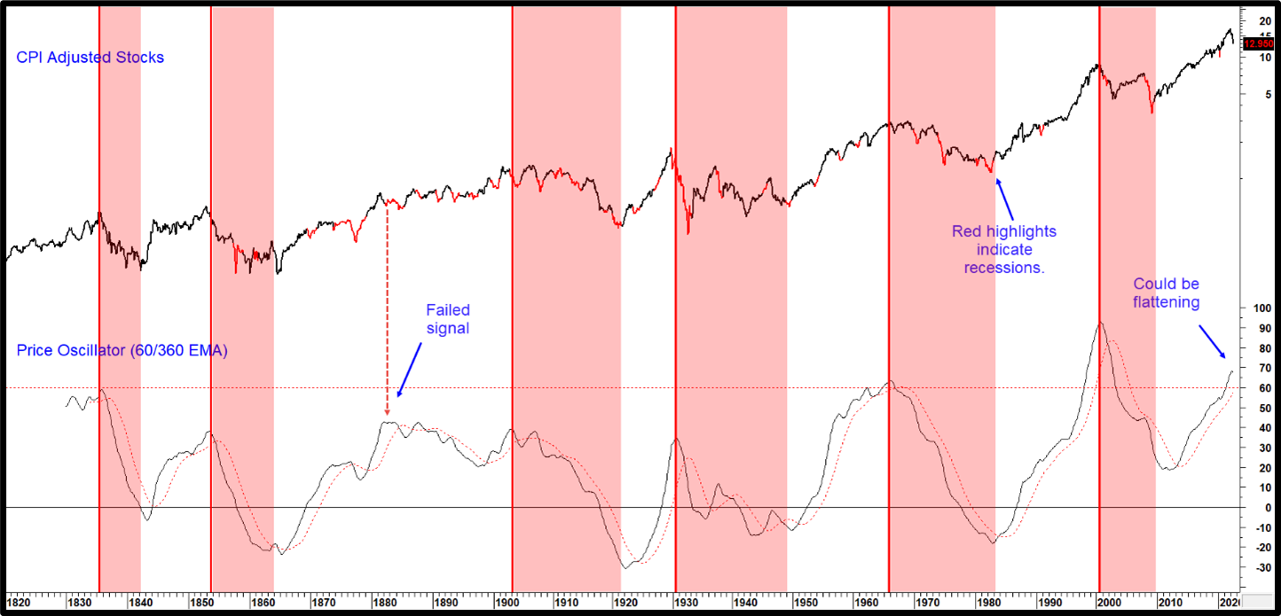
All secular bear markets are characterized with a long-term (10- to 20-year) decline in inflation adjusted stocks. These pervasive negative trends are almost always caused by elevated price inflation, but parts can also be characterized by excessive deflation, as in 1921, 1929 – 1932 and more recently the late 2008 early 2009 part of the financial crisis. These unusual swings in inflationary and deflationary forces reflect longer-term structural problems, which is why secular price movements typically extend between 10 to 25 years. This point can be appreciated by observing the plethora of recessions that develop during the (shaded) secular bearish periods in Chart 1 and their paucity post 1900 in the unshaded secular bulls. Even those recessions that develop under the context of a secular bull are generally mild; 1960 and 1990, or brief, as in 2020. Because of the length of these very long-term price movements, it’s usually only possible to spot reversals several years after the final turning point. Citing a reversal within 5 months of a possible (January 2022) high with any degree of certainty, is therefore pushing the envelope somewhat. Another difficulty arises from the paucity of data points.
Secular Price Movements from an Historical Perspective
Chart 1 isolates secular trends since the middle of the nineteenth century. The thick vertical lines flag the six previous secular peaks in the price oscillator and the shaded areas their subsequent negative trajectory. While every price high can be identified this way, not every oscillator peak has been associated with an equity secular bear. The late 1870s and early 1880s come to mind. The month of June saw this indicator flatten, but the oscillator, which is calculated by dividing a 60-month by a 360-month Exponential Moving Average (EMA), is still above its moving average (MA). It’s also important to note that oscillator is currently trading at a level only seen once before; at the tail end of the first tech boom. Moving even higher from here will require a monumental dose of upside momentum at a time when the latest data from several secular indicators has started to move in the opposite direction.
Chart 1 -Inflation Adjusted US Equities vs a Secular Oscillator
Overstretched peaks in the oscillator usually signals a secular top.
Source: Martin Pring’s Intermarket Review
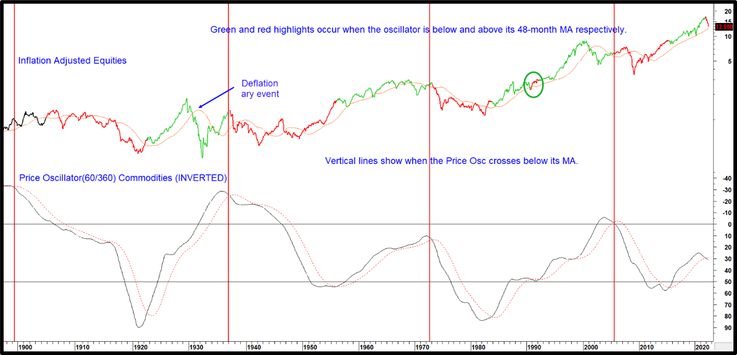
Secular stock movements are closely tied to inflationary and deflationary swings. In that respect Chart 2 compares inflation adjusted equities to a very long-term price oscillator for industrial commodities. The oscillator has been plotted inversely in order to correspond with equity market fluctuations. Consequently, when this momentum series is rising, it reflects a decline in inflationary pressures, which is generally bullish for equities. The red highlights tell us when the oscillator is signaling a negative secular environment. That occurs when it crosses below its 48-month MA. This approach does not pick up deflationary bear markets, which is why the 1929-32 and 2000-2002 sell-offs were not signaled. On the other hand, every time a sell signal is triggered, a bear move is usually underway or follows later. Flaws include the fact that it was early in its 2005 warning and the 1990 signal turned out to be a whipsaw. However, that’s the only one in 120 years of history. The indicator was also unduly late in signaling the all-clear in 1949 and 2009. Earlier this year, a sell signal was triggered, pushing this approach into the secular bearish camp for equites and a bullish one for industrial commodities.
Chart 2 Inflation Adjusted US Equities vs Inverted Commodity Momentum
When the secular commodity trend is up stocks usually suffer.
Source: Martin Pring’s Intermarket Review
The ratio between stocks and commodities is another useful relationship. When in a rising mode, it indicates that stocks are not concerned by what is happening in the commodity pits. From a primary trend aspect though, downside reversals in this relationship suggest rising commodities are beginning to adversely affect profits and is a sign of a weakening bull market, or worse, for stocks.
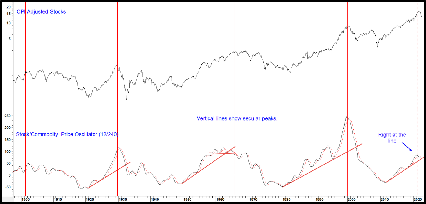
This relationship also holds for secular trends as we can see from the long-term price oscillator in the bottom window of Chart 3. Once again, it’s evident that every secular peak has been signaled by the oscillator, but not every oscillator peak is a secular one. It recently dropped below its MA and has most probably peaked for the current primary trend cycle. On occasion, the oscillator has also lent itself to trendline construction. Indeed, it has been possible to construct up trendlines for the three previous secular bulls. Their violation confirmed that a peak had taken place. The oscillator is currently right at a fourth up trendline. The next couple of months will likely decide whether it’s violated or if a third post 2010 oscillator rally will materialize.
Chart 3 Inflation Adjusted Equities and a Stock/ Commodity Oscillator
Genuine oscillator peaks warn of a possible secular trend reversal.
Source: Martin Pring’s Intermarket Review
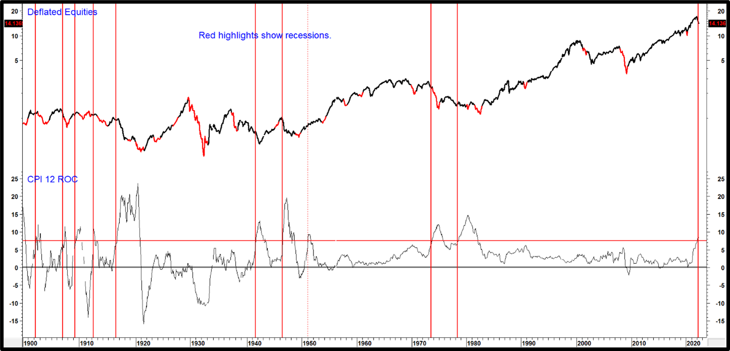
.One important characteristic of a secular bear for stocks occurs when the CPI exceeds 7.5-% on a year-over-year basis (Chart 4). This has happened ten times since 1900. On each occasion, with the notable exception in 1951, inflation adjusted equities were in a secular bear. These instances have been flagged with the vertical red lines. This observation underscores the fact that secular bears are caused by structural, as opposed to cyclical, imbalances. One reason is that inflation adversely affects lower income individuals the worst with a de facto tax of its own. Unfortunately, they have a very elastic demand curve and consequently find it very difficult to adjust to rapidly rising prices.
It’s worth noting that the 1951 example was preceded in 1950 by a high of +6.5% in the 18-month ROC for inflation adjusted M2. Compare that to 2021, when the ROC topped out at a post 1945 record of +25%. Finally, the 1951 situation developed at the beginning of a secular equity bull (1949-1965/6), whereas many indicators are suggesting that after 13 years, we are currently closer to the end of one.
Chart 4 Deflated Equities and a 12-month ROC of the CPI
When the CPI exceeds 7.5% annualized growth, stocks are usually in a secular bear market.
Source: Martin Pring’s Intermarket Review
Stocks versus M2
One of our favorite long-term relationships is the ratio between stocks and money supply (M2). When rising it means that stock market participants are expecting fresh injections of liquidity to favorably affect the economy and corporate profits. A falling relationship on the other hand, implies that market participants suspect that insufficient liquidity is being pumped into the system to enable the economy to power ahead, eventually resulting in a growth slowdown or even an actual business contraction.
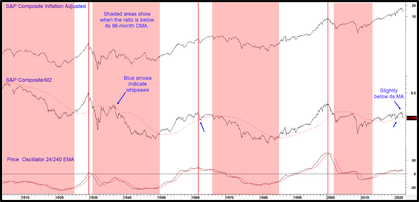
The ratio is helpful from both a secular and primary trend aspect. Chart 5, for instance, shows that it tracks secular price movements in inflation adjusted stocks quite closely. One technique for isolating the status of the secular trend is to observe when the ratio crosses above or below its displaced 96-month MA. Periods when this relationship is below its MA have been identified with pink shadings. Note there are very few whipsaws during the chart’s 120-year history, so a crossover usually remains in force for many years. The latest plot tells us that the ratio has just started to edge through the MA.
The vertical lines mark oscillator peaks, two of which were followed by a secular bear of some kind. The indicator is currently positioned in a bullish mode above its 24-month MA. However, it has started to roll over and is now very close to a downside reversal. This relationship clearly demands close monitoring going forward for a possible secular sell signal.
Chart 5 Inflation Adjusted S&P Composite vs M2
The S&P/M2 ratio is edging below its 96-month Displaced MA, a secular warning!
Source: Martin Pring’s Intermarket Review
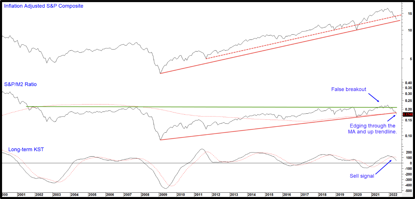
Chart 6 takes this a step further by focusing on the post 2000 period. There are a couple of points to make. First, the ratio experienced a probable false upside break from a massive accumulation pattern. The break is extremely close to being confirmed, which would happen with a decisive drop below the 2009- 2022 up trendline and displaced 96-month MA. Since the long-term KST is in a bearish mode, the odds of a downside break are enhanced. Equally as important, the deflated S&P is just a whisker above its 2009-2022 secular up trendline.
Chart 6 Inflation Adjusted Stocks and the S&P/M2 Ratio
Inflation Adjusted Stocks and the S&P/M2 Ratio
Source: Martin Pring’s Intermarket Review
The Shiller PE
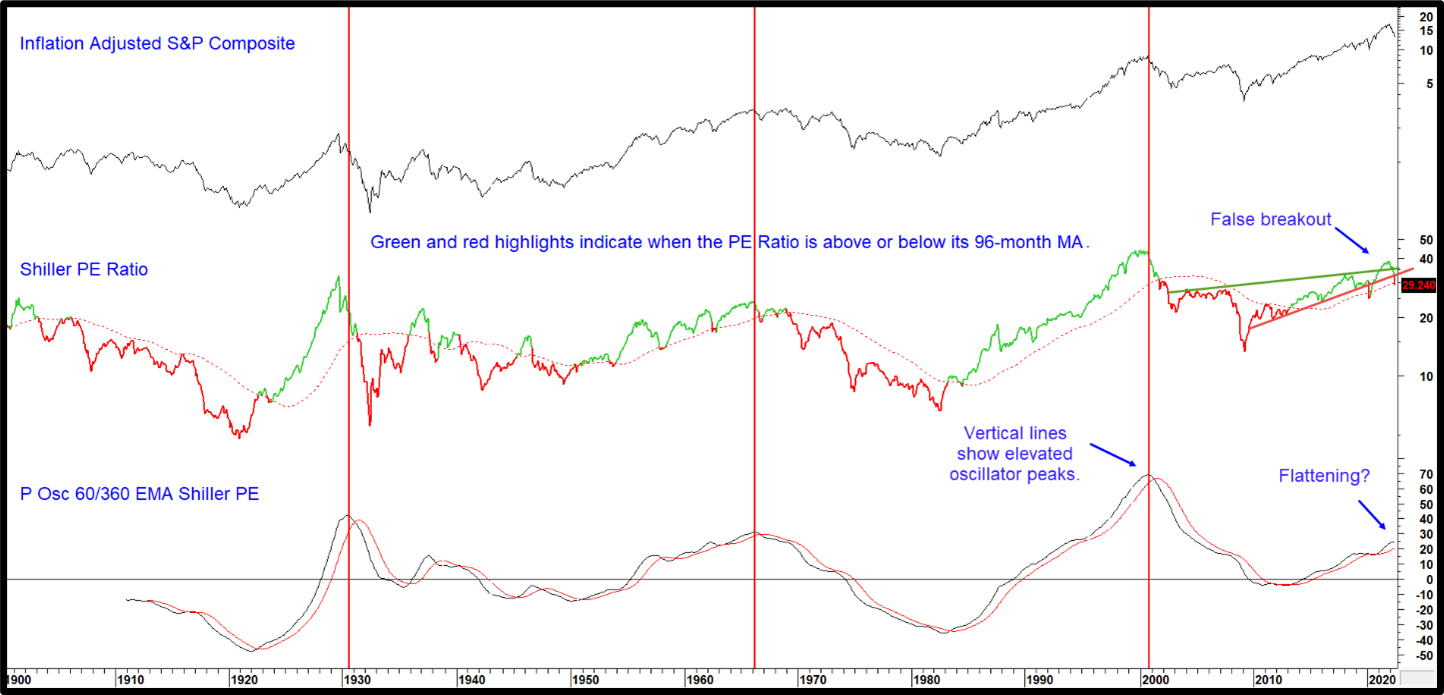
The Shiller PE attempts to smooth out cyclical fluctuations by calculating real corporate earnings over a 10-year period. Most observers regard it as a measure of valuation, but we think of it more as one of sentiment, reflecting as it does, gigantic swings in psychology typical of secular price movements. These swings can be roughly followed by observing the ratio in conjunction with its 96-month MA. Positive periods appear as green highlights in Chart 7, bearish ones in red. At the end of June, the PE was below its 2010- 2022 up trendline and very marginally under the MA. If it continues to hold below them, it will confirm beyond a reasonable doubt that the 2021 upside breakout was an exhaustion move, in effect, placing this indicator in the secular bearish camp. The recent flattening action from the price oscillator, shows that it could be poised to go negative as well. The three previous reversals from an elevated reading were all followed by a secular bear.
Chart 7 Inflation Adjusted Stocks vs the Shiller PE
Shiller P/E momentum is starting to reverse its secular uptrend.
Source: Martin Pring’s Intermarket Review
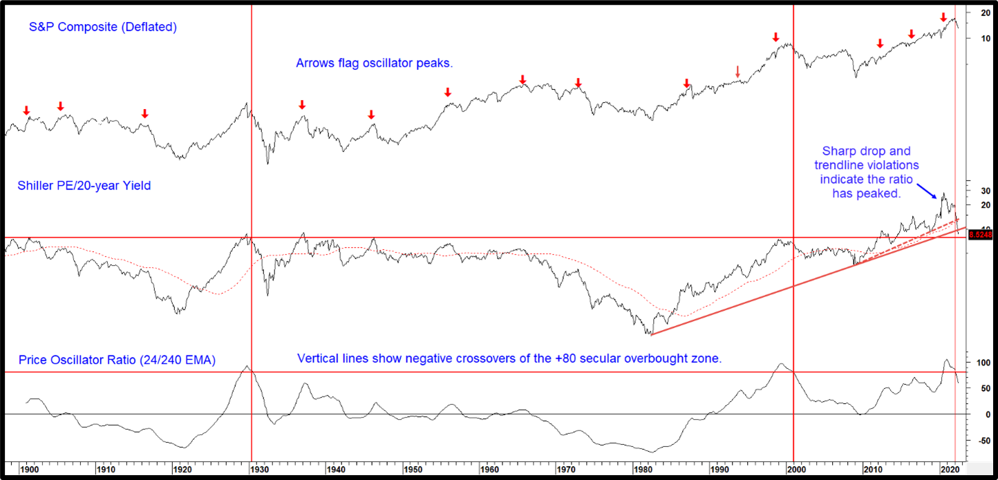
Comparing the PE to the government 20-year bond yield offers some long-term perspective on the current return between stocks and bonds. The level of that relationship also demonstrates their relative popularity. Until 2010 the cap favoring stocks appeared to be the 8.0 level. As indicated by the red horizontal line. The small arrows in Chart 8 indicate that downside reversals in the oscillator have flagged numerous primary trend sell signals.
That relationship has been falling sharply in the last few months. Worse still, it has dropped decisively below its dashed post financial crisis up trendline and its 96-month MA. We can see that the ratio itself has violated its 2009-2022 up trendline and crossed below its 96-month MA. Finally, it has ever-so-slightly begun to edge below the 1982-2022 up trendline.
Arguably more important is the fact that the price oscillator has dropped below its overstretched zone for only the third time since 1929. Both previous reversals accurately signaled the end of their respective secular bull markets.
Chart 8 Inflation Adjusted Stocks and the Shiller PE/ 20-year Govt Ratio
The ratio crosses blow its overstretched zone for only the third time since 1929. Each prior occasion signaled a secular bear market.
Source: Martin Pring’s Intermarket Review
Conclusion
We can’t be sure that the equity secular bull market for stocks is over, but it’s quite apparent that several reliable indicators are moving in that direction. Many others are on the brink of a sell signal. The saving grace lies in the fact that the inflation adjusted S&P has reached support in the form of its secular up trendline (Chart 6) and several intermediate indicators are in place to support a summer rally and sentiment is quite bearish. It’s possible that any more secular damage can be postponed or avoided completely. Chart 8 also shows that a secular bear does not always begin as an inverted V (1929 and 2002) but can also start off as a trading range (1900 and 1965).
That said, there are enough secular style bearish omens to indicate the necessity of maintaining a cautious stance until the long-term evidence reverts to a more positive direction.
The good news is that it is possible to build wealth during a secular bear market, but investors must first discard the buy-and-hold, indexing and passive asset allocation strategies that worked well in the secular bull market. In a negative secular bear market environment, the same static methods result in severely inadequate returns. Even in this difficult, overall negative atmosphere there will be rewarding cyclical opportunities to grow wealth. And these will be followed by cyclical declines where careful risk management techniques must be employed. The key to success is the understanding of the relationship of business cycles and financial asset classes. In essence, it is having a gameplan for both offense and defense.


