
The S&P Composite has rallied close to 60% since late March, making a historic and remarkable round trip in a short period of time. You would think that after such a move it would make sense to anticipate a significant retracement. From an intermediate term perspective, we can certainly point to a bucket load of momentum indicators that have reached a very overstretched condition on the upside. That means a correction could be in the cards. In bull markets though, it generally pays to focus on the main trend and look up rather than worrying too much about the downside. That is especially true right now because the position of a plethora of primary trend indicators do not resemble a major market top, but more closely indicate the beginning stages of a cyclical bull market.
Let us start with a recently overstretched momentum indicator, specifically the 20-week rate of change (ROC) in Chart 1. Normally, an overbought reading is expected to signal a forthcoming correction. However, when an oscillator coming off a bear market low, reaches an overbought condition way above its historical norm, a correction can follow, but it is actually long-term bullish. Just consider the market’s explosive reaction to the three previous instances when the ROC rallied to the +37.5% green line. A multi-year overbought condition tells us to expect a lot more upside as the cyclical bull market progresses. The elevated reading therefore reflects a strong, young and vibrant bull market. The recent 40+% reading in this indicator is our first reason for believing the new bull market is still in its infancy. Incidentally, there are several other momentum indicators that show similar characteristics, so this is not an isolated example.
Chart 1 – NYSE Composite and 20-week Rate of Change (ROC) 1970-2020
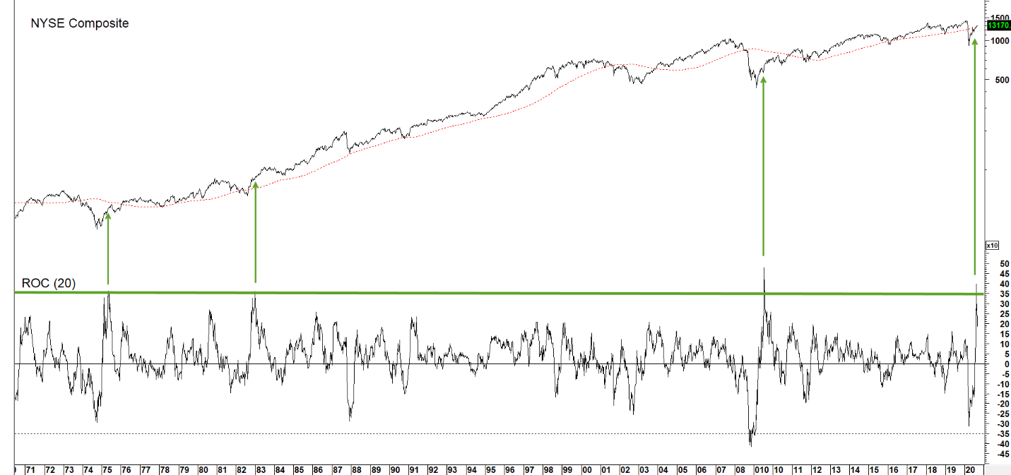
Historically, extraordinary ROC readings have indicated a young and vibrant equity market.
Source: Martin Pring’s Intermarket Review (click chart to enlarge)
Improving trends in confidence are a key ingredient for a rising stock market and expanding economy. Chart 2 demonstrates the connection between shifts in bond market sentiment, and the stock market. These mood swings are reflected by fluctuations in the long-term smoothed momentum of a credit spread between the government 20-year (high quality) and Moody’s Baa corporate yield (lower quality). Rising velocity (for example in 2009, 2012 and 2016) shows when bond investors become more interested in yield than safety. That is due to the fact that they are more aggressively acquiring Baa corporate bonds, as the perception of a growing economy takes hold and fears of defaults are downplayed. An improving economy means higher profits, so a rising momentum curve is associated with a positive stock market. The arrows show upside reversals in the indicator that have taken place from at or below the red horizontal line. The good news is that these reversals have typically been followed by a major stock market rally. The oscillator is currently below its 2009 and 1932 bottoms. Yes, you read correctly, the 1932 bottom! We cannot yet classify it as bullish because the declining trend is still in force. However, it is not a stretch, given the current extreme reading, to expect an imminent reversal in this momentum indicator.
Chart 2 S&P Composite and Credit Spread Momentum 1928-2020
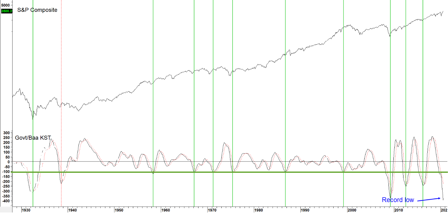
Rising velocity reflects growing confidence amongst bond investors that typically spills over to equities.
Source: Martin Pring’s Intermarket Review (click chart to enlarge)
Chart 3 looks at an important inter-asset relationship. It compares the S&P Composite to a smoothed long-term momentum of the ratio between stock and bond yields. Rising momentum means that investors have begun to favor stocks over bonds.
Chart 3 S&P Composite and Stock/Bond Yield Momentum 1926-2020
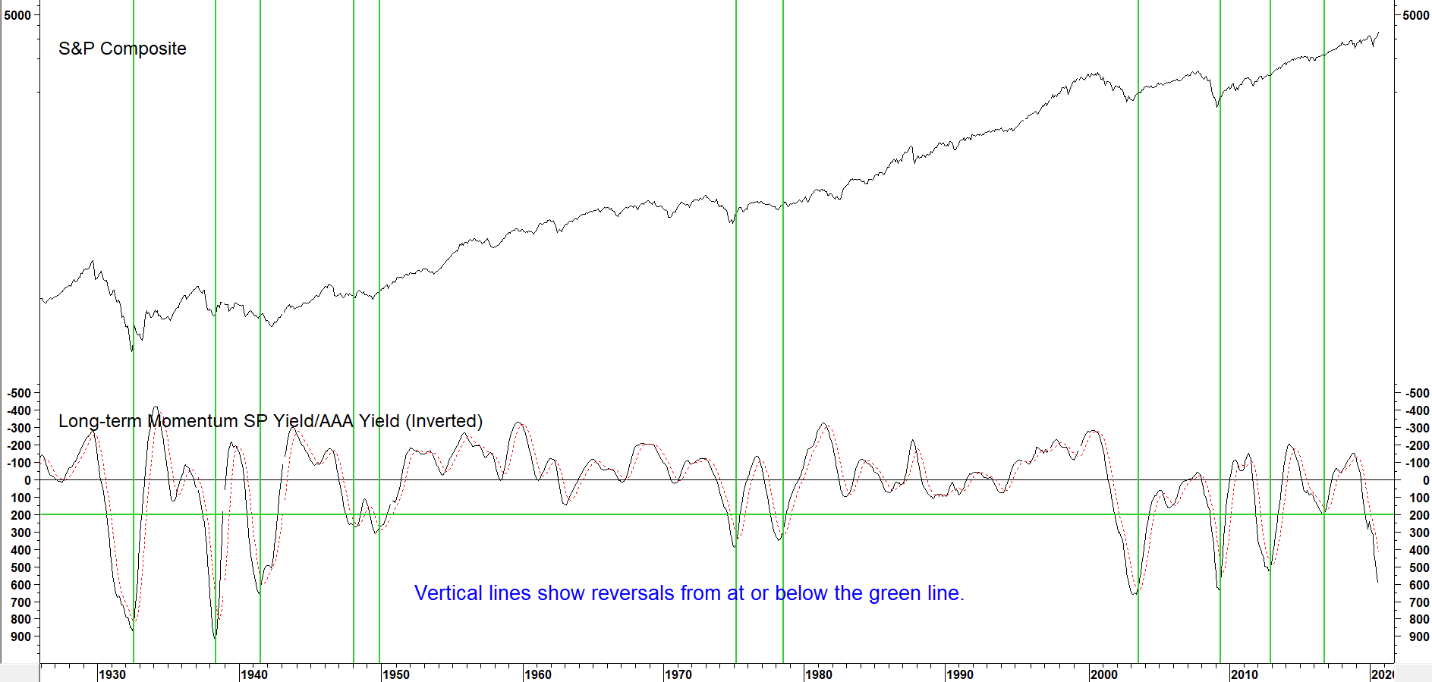
When momentum in this indicator bottoms, stock prices tend to rise.
Source: Martin Pring’s Intermarket Review (click chart to enlarge)
The vertical arrows show that the indicator has a tendency to bottom several months after equities themselves. This is due to the fact that bond prices bottom out ahead of equities during the contractionary phase of most business cycles, causing the momentum of their relationship to follow suit. This series is also declining, and currently trading at a very low level. One of its characteristics is that reversals from low readings rarely experience false starts once underway. That means that when this relationship does finally turn, it is likely to represent a valid bull market signal.
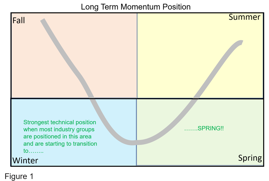
Chart 4 features an indicator that plots the number of S&P industry groups experiencing a long-term smoothed momentum that is below zero and falling. We call this the “winter” position (see Figure 1) because it is as bad as things can get. When the indicator rises to a high level, it tells us that many industry groups have been so weak that they are now in position to support a long-term bull market. As long as the number of weak industry groups is rising, it places downward pressure on the S& P Composite itself. However, when broad industry group weakness finally peaks, the implication is that the smoothed momentum of some components has started to reverse to the upside. We call that moving into the “spring” position. Previous “winter” peaks have been flagged by the vertical arrows. The green dashed one warns us that this approach, like all others, does fail from time-to-time, and is by no means perfect. The Winter indicator has once again moved to an elevated reading (a large number of groups with poor long term momentum), telling us that they are positioned to reverse from “winter” to “spring” and could very well support a broader-based rally from here. However, an insufficient number of groups have transitioned into the “spring” position so far, but we are on alert for a buy signal.
Chart 4 S&P Composite and “Winter” Momentum 1957-2020
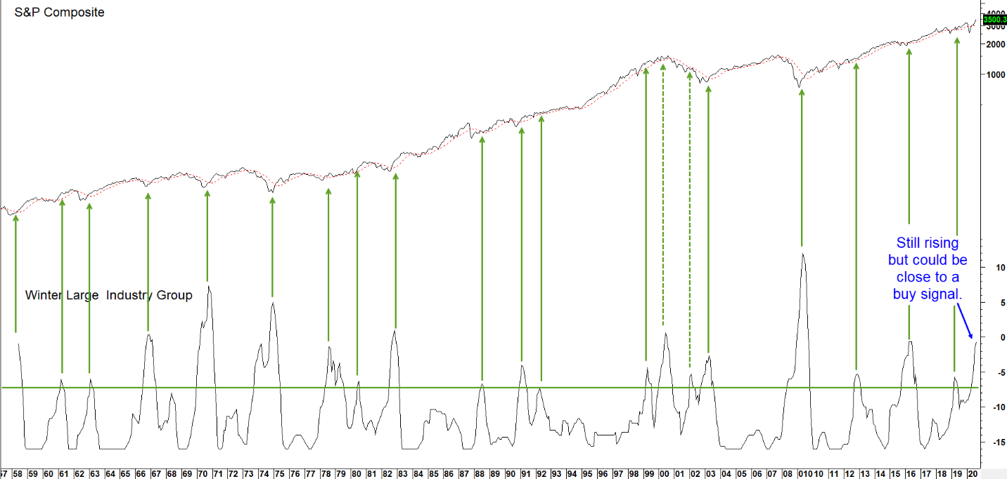
When the number of industry groups in “winter” position peaks, stocks are in position to rally.
Source: Martin Pring’s Intermarket Review (click chart to enlarge)
Upward swings in commodity prices reflect an improving economy. Since it, corporate profits and equity prices are closely linked, Chart 5 compares the CPI adjusted S&P to an 18-month ROC for the Commodity Research Bureau (CRB) Spot Raw Industrials. When the ROC bottoms, it indicates that commodity prices are headed higher. Given the implication of a stronger economy, such action almost always translates into higher equity prices. This is especially true for commodity sensitive and earnings driven sectors such as materials, mining and energy. It is important to note that this positive commodity/equity relationship is limited to the early and mid-phases phases of a commodity bull market. It is not applicable to later stages, when capacity constraints result in an overshooting of prices, which adversely affects the bond market, economy and stock market.
Chart 5 S&P Composite and Commodity Price Momentum 1937-2020
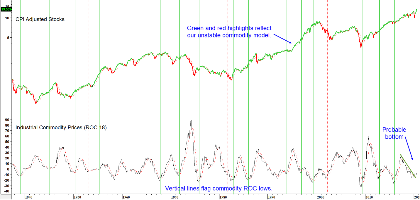
When commodity momentum bottoms it typically signals a stronger economy and stock market.
Source: Martin Pring’s Intermarket Review (click chart to enlarge)
The ROC is currently rangebound but looks like it is in the process of reversing. Based on its historical relationship with equities, that would be extremely bullish. One indicator that strongly argues in favor of a bull market for industrial commodity prices is our Inflation Barometer. This model, featured in Chart 6, has just turned bullish. The green highlights offer a visual representation that freshly minted buy signals are usually followed by substantially higher commodity prices.
Chart 6 CRB Spot Raw Industrials and the Inflation Barometer 1955-2020
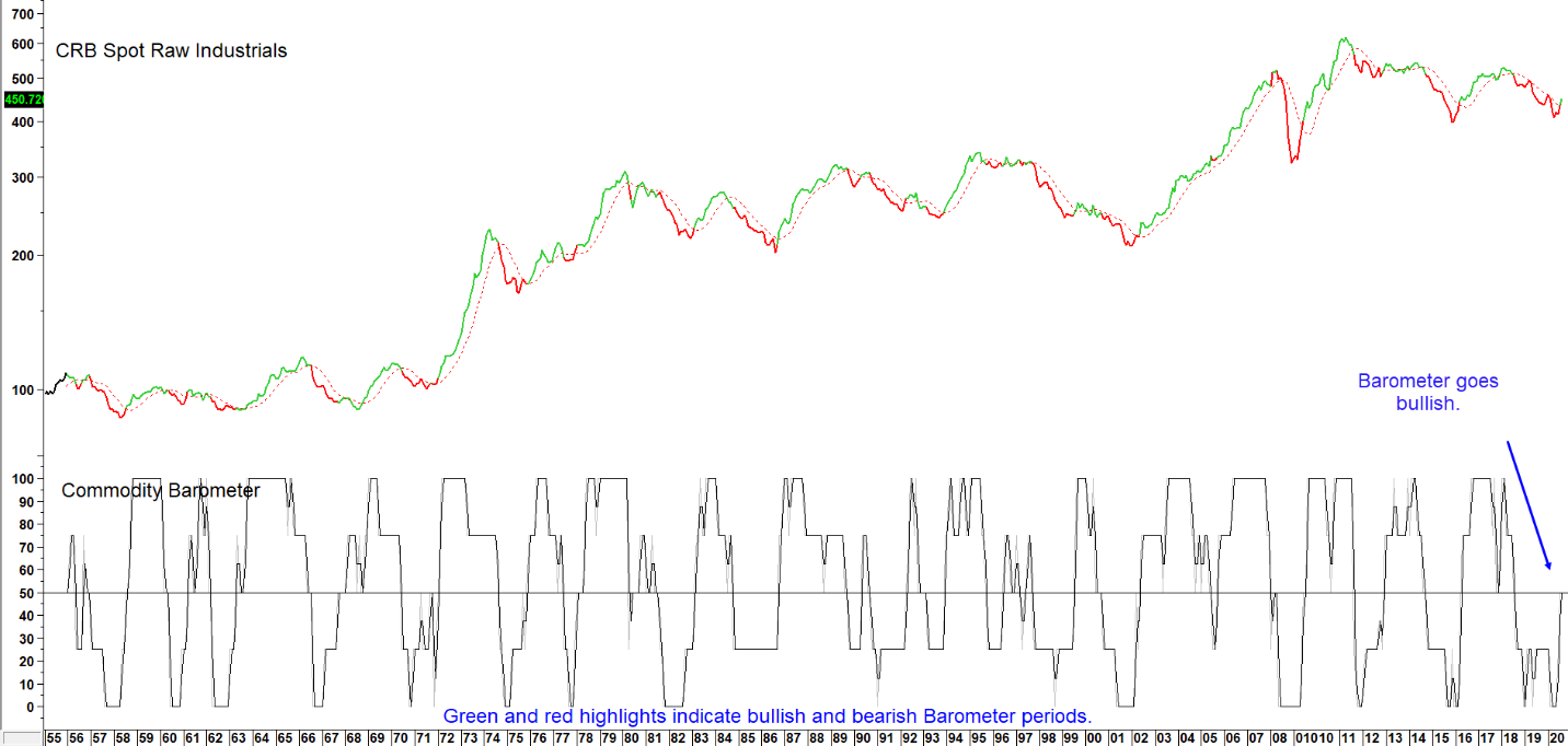
Green highlights indicate bullish Barometer readings at 50% or higher.
Source: Martin Pring’s Intermarket Review (click chart to enlarge)
Summary
After a wicked stock market decline into late March and impressive 60% advance off the low, it seems a stretch to expect still higher equity prices. However, a major extension to the post March rally is definitely supported by the five reliable long-term indicators featured in this research note. Their current position is far more consistent with a major long-term buying opportunity than a selling one. Some form of interim corrective market activity should not be ruled out. But we believe that any shorter-term weakness will present an opportunity for investors to take advantage of a broadening array of improving industry groups. Indeed, this party may just be getting started!
We will continue to monitor the business cycle in future editions of the Intermarket Review. Don’t miss any updates. Click here to sign up for our free newsletter.
Photo by Hans Eiskonen on Unsplash