
There is little doubt that the US economy is in a state of slowdown. That’s actually a good thing, because it offers some time to pause and refresh, thereby postponing either a recession, overheating or both. These pauses perform the same function as a pit stop in a car race, where a quick refueling and servicing reduces the possibility of burst tires or even engine failure when the car returns to the race. The big question, is “How will the economy emerge from this slowdown?” Will it be with renewed growth like 2016? or Does it fall into a full-blown recession a la 2007? The answer to that question is unknowable at this point in the cycle. What we can do though, is to examine a few indicators that we have successfully used as investment managers for guidance in the past.
For stock market investors, the difference between slowdown and recession is a very important consideration in protecting portfolios from major drawdowns. That’s, because slowdowns are usually linked with mini-bear markets of 10-20%, and in some instances no decline at all. On the other hand, recessions are associated with some of the most severe bear markets on record. The distinction is also important, because slowdown associated bears usually develop under the context of a secular bull market. For instance, there were two slowdowns in both the 1960’s and 1990’s. Each of those periods experienced a secular bull market. Since the last business cycle contraction, in 2008-9, the economy has experienced two slowdowns. One took place in the 2011-12 period, and another between 2015 and 2016. Both experienced mini-bear markets, which formed part of a secular equity uptrend. There are no instances where recessions have been separated by three growth slowdowns. We will soon find out if the current situation breaks from the past. Certainly this business cycle expansion has been unique in many ways, including the fact that it has been amongst the longest, yet slowest on record. How and when it ends could also be unique.
The Reality of a Slowdown
Chart 1, features the Chemical Activity Barometer (CAB), a composite leading economic indicator, published by the American Chemistry Council. The red highlights indicate NBER defined recessions and the beige ones, slowdowns. These are defined as a period when the smooth momentum declines but reverses to the upside prior to a negative equilibrium crossover.
The vertical lines show a 41-month cycle, which seems to explain many of the momentum troughs and several of the cyclic peaks. That’s not surprising since the average time between recessionary troughs in the 1857-1960 period was 41-months. Since then, the economy has experienced seven recessions, and by our count, eight slowdowns. That’s an average trough to trough separation of 40.7 months. Chart 1, which centers the 41-month cycle at the 2009, correctly called for the 2012 and 2016 lows. The next one is projected for the late summer of 2019. A better approach though, is to appraise the status of the indicators at that time, rather than simply relying on a simple average of prior cycles.
The momentum series peaked during the late summer, and has since been accelerating on the downside. The CAB itself has started to drop, and is now slightly below its 12-month MA. Since the oscillator is currently in a bearish mode, the chart sports a tentative beige highlight. Unfortunately, it does not reveal whether the current path of declining growth will end from a position above zero, where the termination of a slowdown is signaled, or if it drops below zero and morphs into a recession.
Chart 1 Chemical Activity Barometer and Smoothed Long-term Momentum 1955-2018
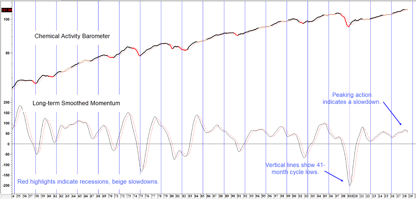
Sources: American Chemistry Council, Pring Research
Momentum reverses from above equilibrium during slowdowns. It crosses below zero during recessions. (click chart to enlarge)
Identifying the End of the Slowdown
There are a couple of reasons why slowdowns are more difficult to detect than recessions. First, they are not reflected in all economic sectors, unlike recessions in which most participate. For example a slowdown that developed in the mid-1980s was not felt on the two coasts but recessionary type conditions were experienced in the rust belt and oil patch. Second, by their very nature, slowdowns reverse very quickly, and are often over before we know it. Take the smoothed momentum in Chart 1 for instance. It signals a trend of renewed growth by reversing to the upside, but in many cases that happens with a frustratingly long lag.
One alternative for identifying the termination of a slowdown (Chart 2) is examining the data for a leading economic indicator provided by the Economic Cycle Research Institute (ECRI). Here we constructed a price oscillator, by dividing a 6 by a 15-month EMA of the ECRI Weekly Leading Economic Indicator.
Chart 2 ECRI Weekly Leading Economic Indicator and a Price Oscillator 1968 -2018
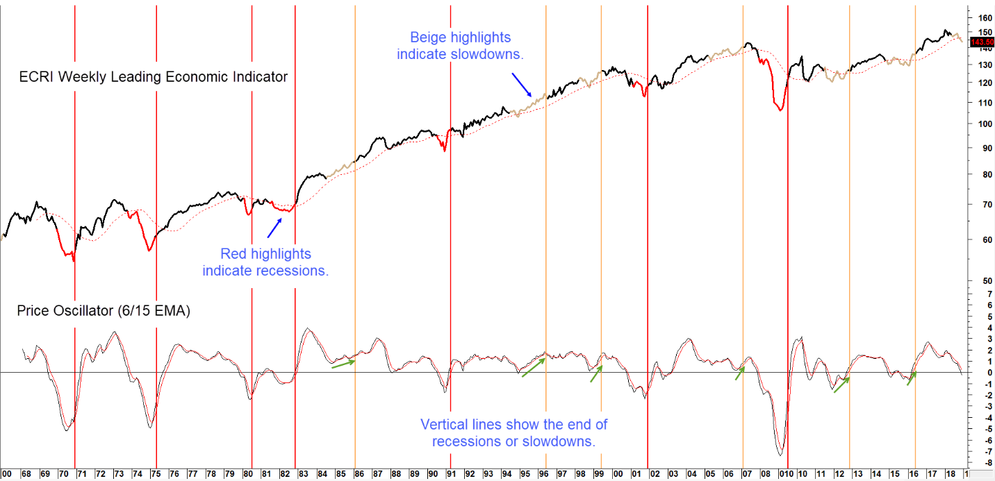
Sources: Economic Cycle Research Institute, Pring Research
The Price Oscillator usually reverses to the upside prior to the end of the slowdown. It’s still declining.(click chart to enlarge)
The vertical beige lines flag the end of the slowdown period. Since the late 1960’s, every slowdown has been preceded by a bottoming in the oscillator, as indicated by the upward sloping green arrows. Currently, it is falling sharply and therefore offering no indication of a reversal.
Another important indicator to follow is a bond market confidence ratio. Swings in the ratio between 20-year Government and Moody’s Corporate Baa bond yields reflect changes in sentiment amongst bond traders. When market participants are confident about the economy, they shun the quality of government paper. Instead, they go for higher yields obtainable from the riskier corporate bonds. This positive sentiment is reflected in the chart by a rising ratio. Alternatively, during times of economic stress, fear of default triggers a cautious attitude in the form of declining spread favoring the security of government bonds.
Chart 3 compares this confidence ratio to its long-term smoothed momentum. The vertical lines flag the end of slowdowns. It is fairly evident that the oscillator bottoms around the same time. In some instances, a reversal leads the end of the slowdown and in rare cases there is a tiny lag. Right now, the momentum series is declining, and is therefore consistent with a slowdown scenario. It is also in overstretched territory, which suggests that it is unlikely to reverse in the immediate future.
Chart 3 Govt 20-year/Moodys Corporate Baa Yield and Momentum
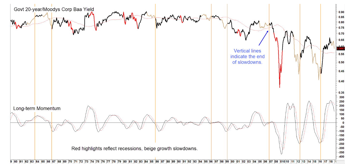
Sources: Federal Reserve Bank of St. Louis, Pring Research
Swings in credit spread momentum, signal changes in confidence levels that affect the economy. Today, confidence looks to be a long way from its usual sub-zero reversal.(click chart to enlarge)
Yet another indicator that is well-worth monitoring is the Boom Bust Barometer made famous by Dr. Ed Yardeni. It is calculated by dividing the CRB Spot Raw Industrials by initial claims for unemployment. A rising ratio reflects a growing economy and vice versa. Once again, red highlights indicate recessions and beige, slowdowns. The vertical lines point up the termination of a slowdown. It is fairly evident that pretty well every one since the early 1980’s has been preceded by a slight reversal in the momentum series in the bottom window. Currently it is in a declining phase. This trend looks likely to extend because the Barometer itself is struggling to remain above its 2009-18 recovery trendline.
Chart 4 Yardeni Boom Bust Barometer vs Long-term Smoothed Momentum
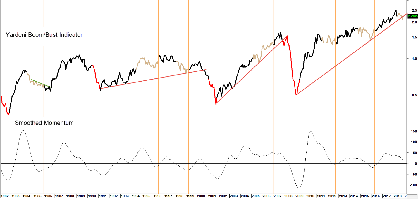
Sources: Federal Reserve Bank of St. Louis, Barchart.com, Pring Research
When the momentum series turns up it signals the end of a recession or slowdown. Watch for the next upturn in momentum to signal all clear ahead. (click chart to enlarge)
Reliable Recession Callers
The previous three charts should be helpful in identifying when or if the economy emerges positively from the slowdown, but how will we know if the slowdown is transitioning to a recession? Chart 5 gives us a leg up on this question. The series in the upper panel is a 4-week MA of initial unemployment claims, which tend to lead business cycle activity. The data in both windows have been plotted inversely to correspond with swings in the economy. The vertical red lines signal the approximate beginning of previous recessions. From a timing point of view, it’s important to note that recessions roughly intersect with oscillator crossovers of the red horizontal line at 5%, from a decline that starts from above the zero line. This has happened consistently with every recession since the late 1960s. Two non-recessions were signaled in the red ellipses. Right now, the indicator is comfortably above the recession signaling zone, but it has started to decline. The key will be to see if the 2010-18 up trendline for the initial claims series is itself more seriously ruptured. Note, that six of the last seven recessions were signaled by a trendline break. If the current one is more decisively violated, baring inclement weather or some other temporary factor, that would probably indicate the kind of dissipation of upside momentum consistent with the oscillator starting on its descent towards that key red line. Stay tuned.
Chart 5 Inverted Initial Claims and a Price Oscillator

Sources: Federal Reserve Bank of St. Louis, Pring Research
Negative zero crossovers by the price oscillator signal recessions. No recession signaled yet, but we are watching. (click chart to enlarge)
Finally, Chart 6 compares weekly average wage earnings with part time employment for economic reasons. A rise in earnings reflects economic strength, whereas an increase in part time workers is an early bird signal that business activity is softening. When strength in earnings cannot keep up with a rise in part time workers, the ratio peaks and vice versa. Recessions, have fairly consistently been called as the price oscillator drops below the equilibrium level. In many instances it has been possible to construct an up trendline in the oscillator, the violation of which, has been the first step in the journey to a zero crossover. The current cycle is no exception to this rule, as the oscillator is currently positioned just a tad above the trendline. The joy of this indicator is that it does not call slowdowns, only recessions. The 1966 experience was an exception to this rule. Consequently, if it does slip below the equilibrium level the odds of an economic contraction will be greatly enhanced.
Chart 6 Average Weekly Earnings/Part Time Workers and a Price Oscillator
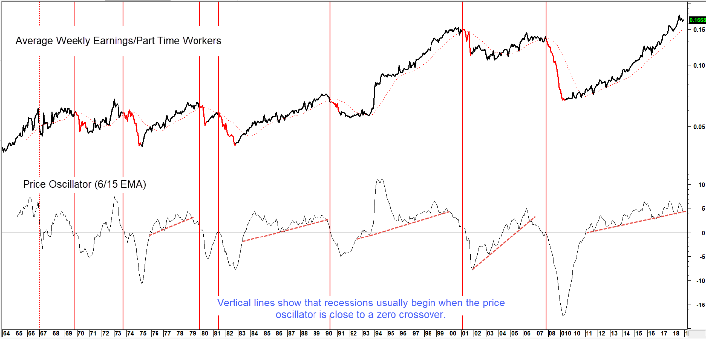
Sources: Federal Reserve Bank of St. Louis, Pring Research
A sub-zero crossover by the oscillator usually signals a recession. Still comfortably above recession levels as we start 2019. (click chart to enlarge)
The evidence of an economic slowdown is fairly conclusive. What we do not know, is when it will end, or if it will morph into a full-blown recession. The indicators outlined here are not perfect, but well worth monitoring to gauge the underlying risk to financial markets. For ongoing business cycle and market research updates subscribe to our blog.