
At the beginning of 2000, I unsuccessfully submitted a bearish stock market article, A Turn of the Tide, to a well-known US financial publisher. At the time, in the middle of a market mania, my contrarian warning was unwelcome. Ironically, it was later carried by a Polish financial magazine—not exactly the wide distribution channel I was hoping for! This incident is being brought up now because the S&P Composite, when adjusted for inflation, has made no real progress in the intervening 16-years. That said, it now looks as though bullish forces are conspiring to take prices through the 16 year inflation adjusted glass ceiling to significantly higher levels. Guiding the way higher is our composite stock market indicator the stock “Speedometer”. Before we review that evidence, it makes sense to back up a little in order to evaluate things from a longer-term perspective.
Valuation- a Wall of Worry
Chart 1 compares the inflation adjusted S&P Composite to the renowned Shiller P/E, the so-called CAPE (Cyclically Adjusted P/E ratio).
Chart 1 Inflation Adjusted Stocks versus the Shiller P/E
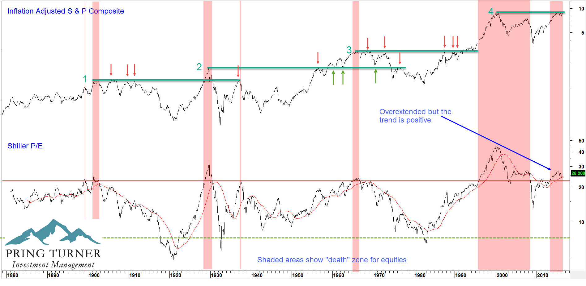
(Source: Martin Pring’s August Intermarket Review – Click Chart to Enlarge)
High valuations are a problem but only when the trend is negative
At Pring Turner we think of the Shiller P/E as not only a valuation but also a sentiment indicator. High readings indicate confidence, as investors are willing to pay a very high price per each dollar of earnings. Compare that to depressed levels at secular lows, when there is so much fear and pessimism that those same investors demand a much lower price per dollar of earnings (lower P/E) for the huge risks they perceive.
Right now, this indicator is at a high level when compared to historical readings. It’s in what we call the equity “death zone”, as flagged by the pink shaded areas. There is no doubt that the level of this indicator concerns us, but that doesn’t mean a stock price collapse is imminent. In fact, stocks can continue to rise despite the lofty valuations. For example, what was historically extended in 1928 and 1995 became even more stretched by the time the market peaked in 1929 and 2000. The higher you climb on Mount Everest the more dangerous it becomes, but that does not stop determined climbers from taking the risk and pushing through the “death zone” on their way to the summit. In markets, crowd psychology can cause prices to overshoot as market participants become overly confident and expect higher and higher prices. There is no question that the equity prices, by historical measures of very long-term momentum and many valuation yardsticks, are overextended. It is and should be a wall of worry against higher prices. Nevertheless, the vast majority of primary trend indicators (the “tape”) are acting positively.
The Market and the Economy
Over the last century, 3 out of every 4 bear markets occurred during economic recessions. Following business cycle indicators helps us navigate the major ups and downs of the markets. As the economy changes, we make important investment adjustments to better prepare for the road ahead. Bull moves in stocks typically emerge as investors finish discounting recessionary conditions or economic slowdowns. Prices rally as the market senses that a phase of renewed growth is in the air. In this respect, Chart 2 compares the S&P Composite to our Growth Indicator, a composite series constructed from the momentum of several leading economic indicators. The vertical lines flag instances when it reverses to the upside from a position at or below the -12.5% level. Red highlights indicate recessions, the ending of which have been consistently signaled with a bottoming in the Growth Indicator. The signals not connected with recessions mostly developed as the economy was emerging from a growth slowdown, such as in 1962, 1966 and 1984. Each was followed by a very robust equity rally, except for in late 2001. The 2001 reversal correctly forecasted the recovery, but is one of very few instances where the market and the economy were totally decoupled.
Chart 2 S&P Composite versus the Growth Indicator
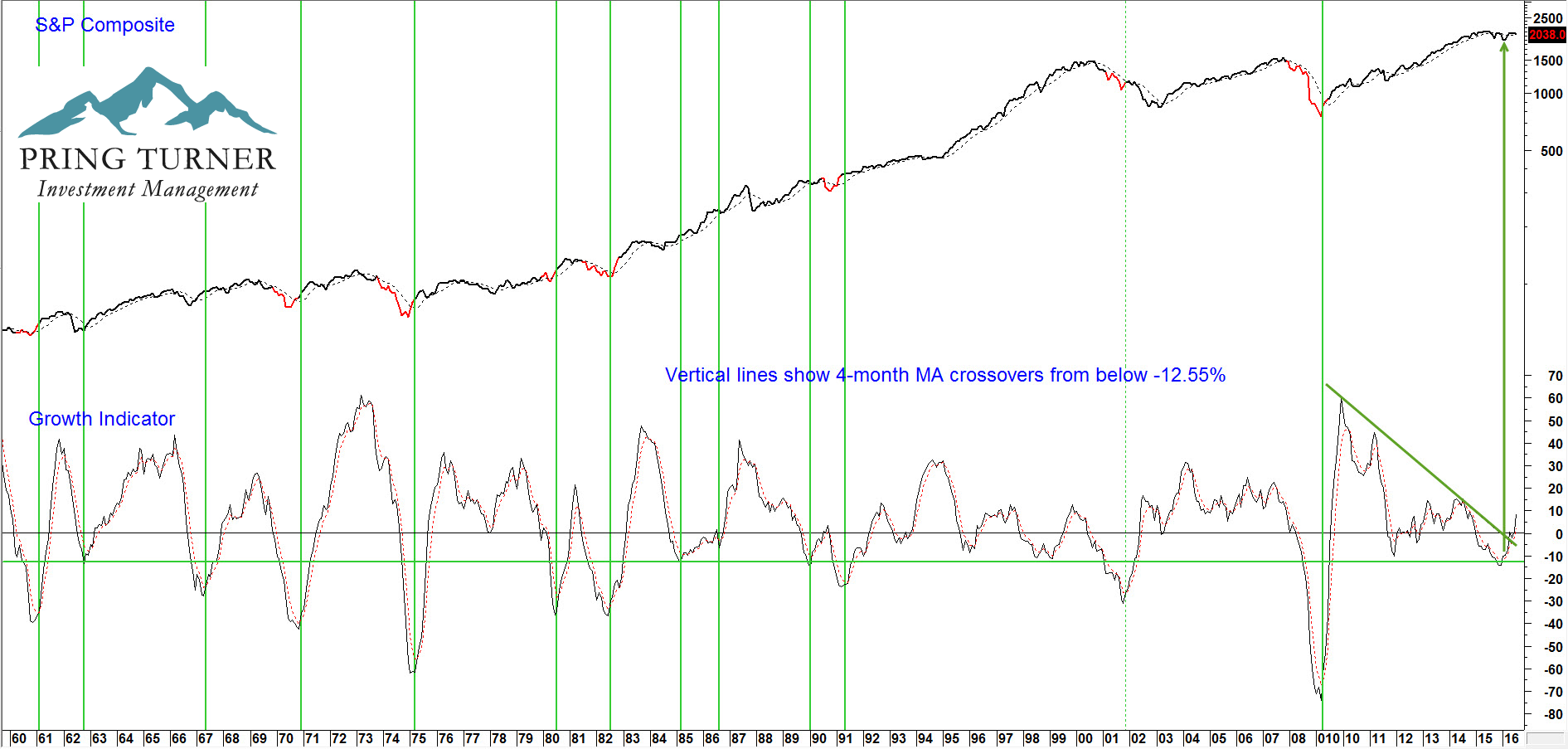
(Source: Martin Pring’s August Intermarket Review – Click Chart to Enlarge)
When the growth Indicator bottoms expect the economy to improve and for stocks to move higher
The recent rally in the Growth series tells us that business activity will likely do its part, so let’s now turn to some market indicators to see whether they are also ready to oblige.
Long-term Stock Market Indicators
Chart 3 features our Financial Velocity indicator, or rather its 6-month moving average. This series combines the rate-of-change of bonds, stocks and commodities into one series. It triggers buy signals by reversing to the upside from a position at or, more commonly, below the equilibrium level. Examples have been flagged by the vertical lines. Most have been followed by important bull moves in inflation adjusted stocks, but one or two, like 1940 and 1978 have not. These reversals signal that sufficient liquidity is being pumped into the system to power the economy, and therefore the stock market, higher. Note that virtually every recession (red highlights) is associated with a turnaround in the indicator. This velocity series has recently reversed for the 22nd time since 1921. This reversal strongly suggests that a new up leg in the bull market is underway.
Chart 3 Inflation Adjusted Equities versus The Financial Velocity Indicator
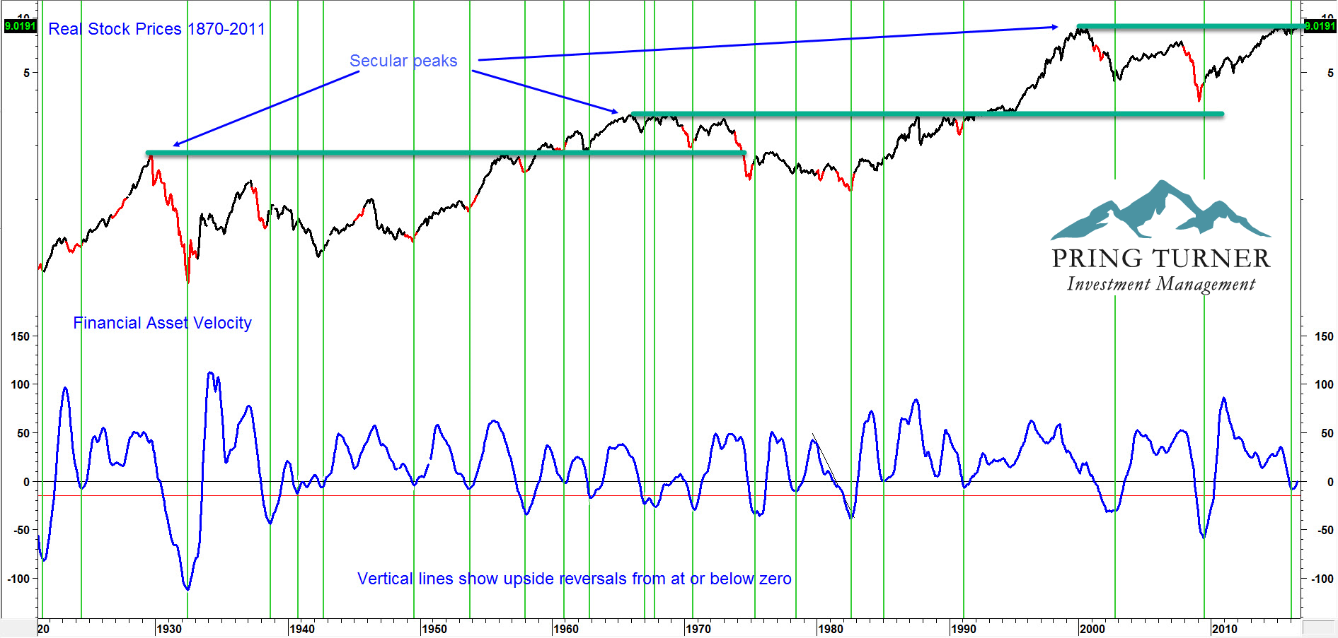
(Source: Martin Pring’s August Intermarket Review – Click Chart to Enlarge)
When velocity bottoms, stocks usually begin a bull market of some kind
Bond Market Confidence
A strong rally in stocks is often associated with an improvement in bond market confidence. One way that this is telegraphed is from reversals in momentum calculated by the ratio between low quality and high quality bonds (government yields/ corporate Baa yields), a so called “credit spread”. This relationship is shown in long-term momentum format in Chart 4. A rising indicator reflects improving confidence amongst bond investors, as they favor higher yielding but more risky Baa corporate bonds over government bonds. The vertical lines tell us that a bottoming in momentum at or below the green “confidence” line indicates that a more positive trend sentiment has begun. In all, there have been eight signals since 1949. In each situation, equities rallied with only the duration and magnitude open to question.
Chart 4 S&P Composite versus Credit Spread Momentum
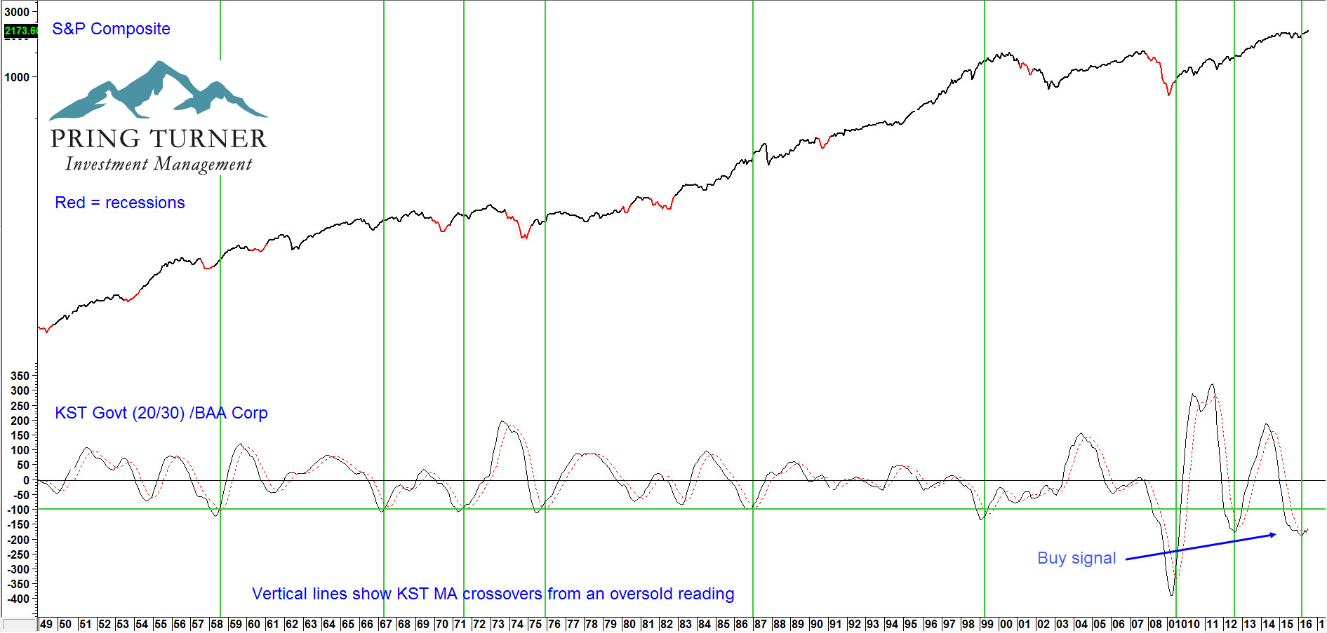
(Source: Martin Pring’s August Intermarket Review – Click Chart to Enlarge)
Stocks are likely to rise when the momentum of this credit spread bottoms from a low level
Chart 5 expresses market breadth in the form of the momentum of stocks registering net new 52-week highs on the NYSE. The vertical green lines flag when this price oscillator, following a corrective period (blue arrows), moves above the overstretched green horizontal line. This action suggests the market is severely overbought; however, unlike most overstretched conditions, this is positive because it usually reflects a bull move in its initial stages. The chart shows that each of these six instances has been followed by a worthwhile advance since the 1970’s.
Chart 5 NYSE Composite versus a Net New High Oscillator
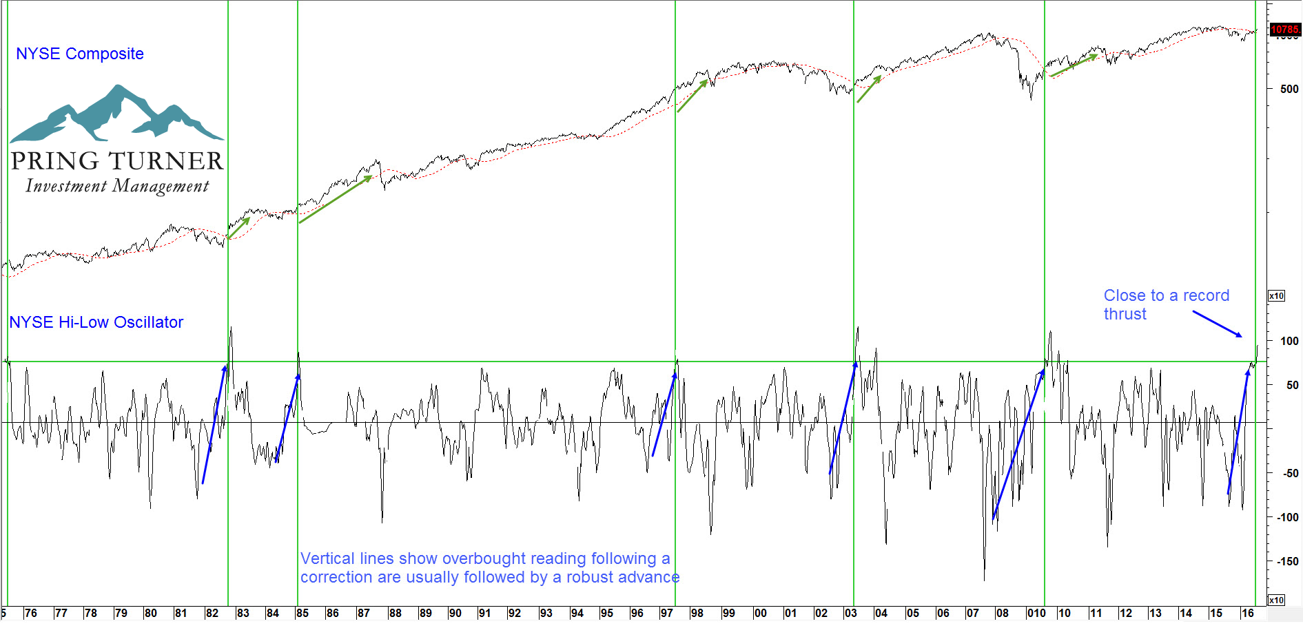
(Source: Martin Pring’s August Intermarket Review – Click Chart to Enlarge)
A sharp oscillator correction followed by an overbought reading means higher prices are to come
The sixth and final bullish indicator is our “Stock Speedometer”. The Stock Speedometer is a combination of a wide range of market indicators. Historically higher readings have led to better returns for the average stock; conversely, lower readings have led to poor results. The speedometer is designed to identify the primary environment of the stock market. Similar to your car speedometer, it signals how fast or slow we, as sub advisors, drive our portfolios. As the Speedometer changes, important portfolio adjustments are made in order to better navigate the financial road conditions ahead.
The Stock Speedometer has two crucial areas: a “Safety Zone” and a “Danger Zone”. Since 2000, the NYSE Composite returned +12% per year on average with the speedometer in the positive or Safety Zone. In comparison, it declined -21% per year on average when the speedometer was in the Danger Zone. The latest reading is 90%, which is firmly in bullish territory, thereby indicating an above average exposure to equities.
Chart 6 Pring Turner Stock Speedometer
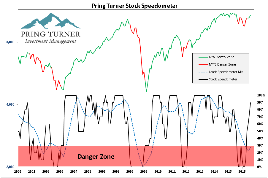
The current high reading means it is safe to drive portfolios at a faster speed
Conclusion
There is no doubt that the high reading in the Shiller P/E is a cause for concern, a definite wall of worry if you will. Still, history demonstrates that markets can, and often do, overshoot. This does not mean that breaking through the glass ceiling denotes that the sky is the limit. Rather, it tells us to stay the course as long as our Speedometer and other indicators continue to signal safe driving conditions for portfolios. We welcome questions or comments about any of the 6 indicators or inquiries about our sub-advisory services.
Thank you for reading.
Martin Pring
Click the following link to download the PDF Glass Ceiling 6 Reasons to Be Bullish
DISCLOSURES:Pring Turner Capital Group (“Advisor”) is a financial advisor based in Walnut Creek, CA. The Advisor invests on behalf of individuals, organizations, and other financial advisors that appreciate a conservative and active investment style that aims to deliver consistent results without taking undue risk. The key objective of the Advisor’s investment philosophy is to not lose big during major market declines, making it easier to compound wealth over the long run.
The Advisor is an investment adviser registered with the U.S. Securities and Exchange Commission. The views expressed herein represent the opinions of Advisor, are provided for informational purposes only and are not intended as investment advice or to predict or depict the performance of any investment. These views are presented as of the date hereof and are subject to change based on subsequent developments.
In addition, this document contains certain forward-looking statements which involve risks and uncertainties. Actual results and conditions may differ from the opinions expressed herein. All external data, including the information used to develop the opinions herein, was gathered from sources we consider reliable and believe to be accurate; however, no independent verification has been made and accuracy is not guaranteed. Neither Advisor, nor any person connected with it, accepts any liability arising from the use of this information. Recipients of the information contained herein should exercise due care and caution prior to making any decision or acting or omitting to act on the basis of the information contained herein. ©2016 Pring Turner Capital Group. All rights reserved.