My colleagues at Pring Turner Capital recently sent out a note to clients entitled The Pause that Refreshes by way of putting the post July correction in perspective with the 2022-202? bull market. In this article we will first examine some of the indicators justifying that primary trend optimism. Second, use stock market history of the last 125-years to examine where the rally might go from here.
Evidence arguing for a second bull market up leg is being provided by economic, monetary and technical factors. Let’s start with the economy. History tells us that the equity market and the economy are closely related. Since the 1920s there have only been two occasions on which their paths diverged. The first occurred in the late 1920s, when the market refused to buckle to the 1926-7 recession but instead marched straight up to the 1929 peak.
The second was in 2001 when the economy emerged from a recession, but the stock market sold off because it was still in the process of unwinding the tech bubble. For equities to diverge from economic activity is therefore very much the exception rather than the rule.
Three Reasons to Remain Bullish
#1 – The Momentum of a US Leading Economic Indicator is Rising
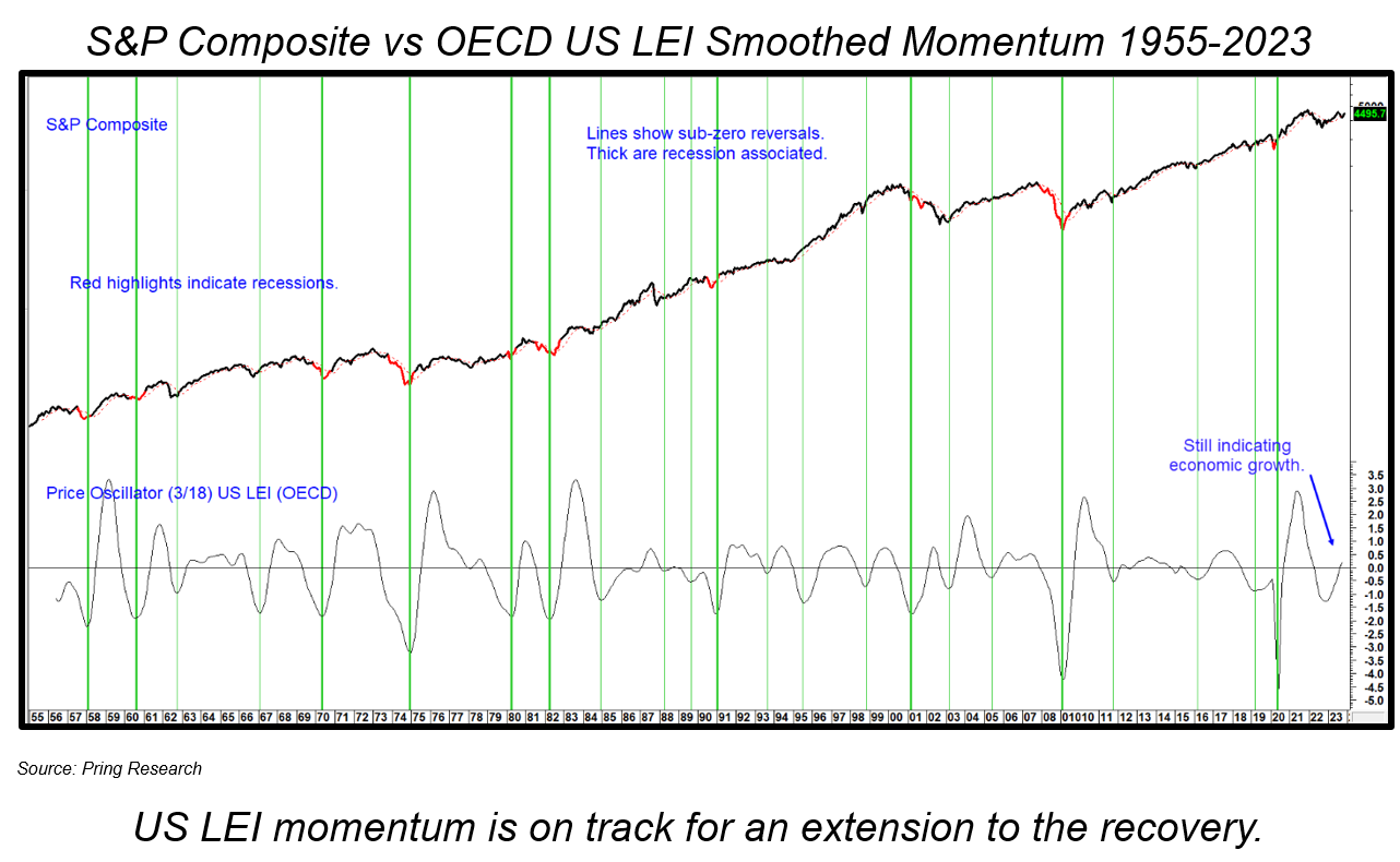
The momentum indicator in Chart 1 has been calculated from data for the US economy as published by the OECD. The vertical lines flag sub-zero upside reversals. The thick ones are associated with the ending of (red highlighted) recessions. The thinner ones reflect other reversals that provided buying opportunities for equities. Since the indicator remains in an upward trajectory, just slightly above the equilibrium point, there are no signs of potential weakness. This places it on track for an improving economy and higher equity prices. Indeed, since 1956 when it has been above zero and in an upward trajectory, the average annualized return has been 12.6%. That compares to all other periods when returns were 6.2%.

#2 – Real Money Supply Momentum is Rising Again
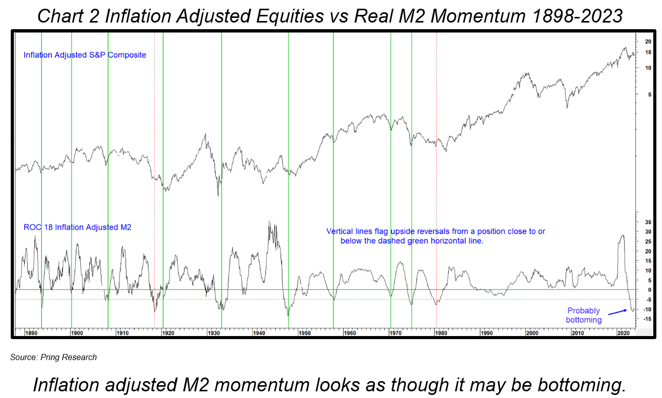
Chart 2 compares the inflation adjusted S&P Composite with an 18-month rate of change (ROC) of the real money supply. The green vertical lines tell us when the indicator bottoms out from close to or below the -5% level a stock market advance usually follows. The chart covers such an extensive period, even the two red dashed signals in 1918 and 1980 labeled as failures, were followed by advances of 1-year and 6-months respectively. All other signals preceded significantly stronger and more durable rallies. There were actually nine examples of a sub -5% reversal. The average annualized gain for inflation adjusted stock prices over a 12-month holding period was 16.2%. That compares to the buy hold approach of 4%.

#3 – Momentum for S&P Yields is Declining
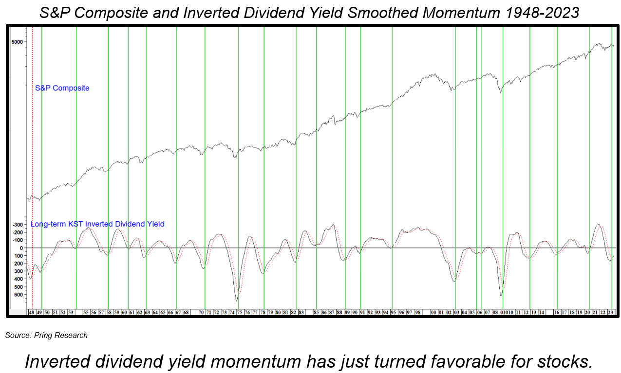
The long-term smoothed momentum (KST) for the S&P dividend yield has been plotted inversely in Chart 3. It goes bullish for equities when it drops below zero and reverses to the upside. This approach can be traced back to the nineteenth century and is one of the most consistent indicators in our technical arsenal. It went positive a few months ago and remains at a relatively subdued level. It is also worth noting that since 1948, all downside reversals developed when the oscillator was above zero. It is currently below zero and rising. Consequently, it seems unlikely a sell signal will be triggered in the immediate future. For the record, since 1874 when the smoothed momentum for the dividend yield has been positively positioned against its moving average, the Index has experienced an annualized return of 10.2% compared to 5.8% for the buy hold approach.

What is the Direction of the Secular Trend?
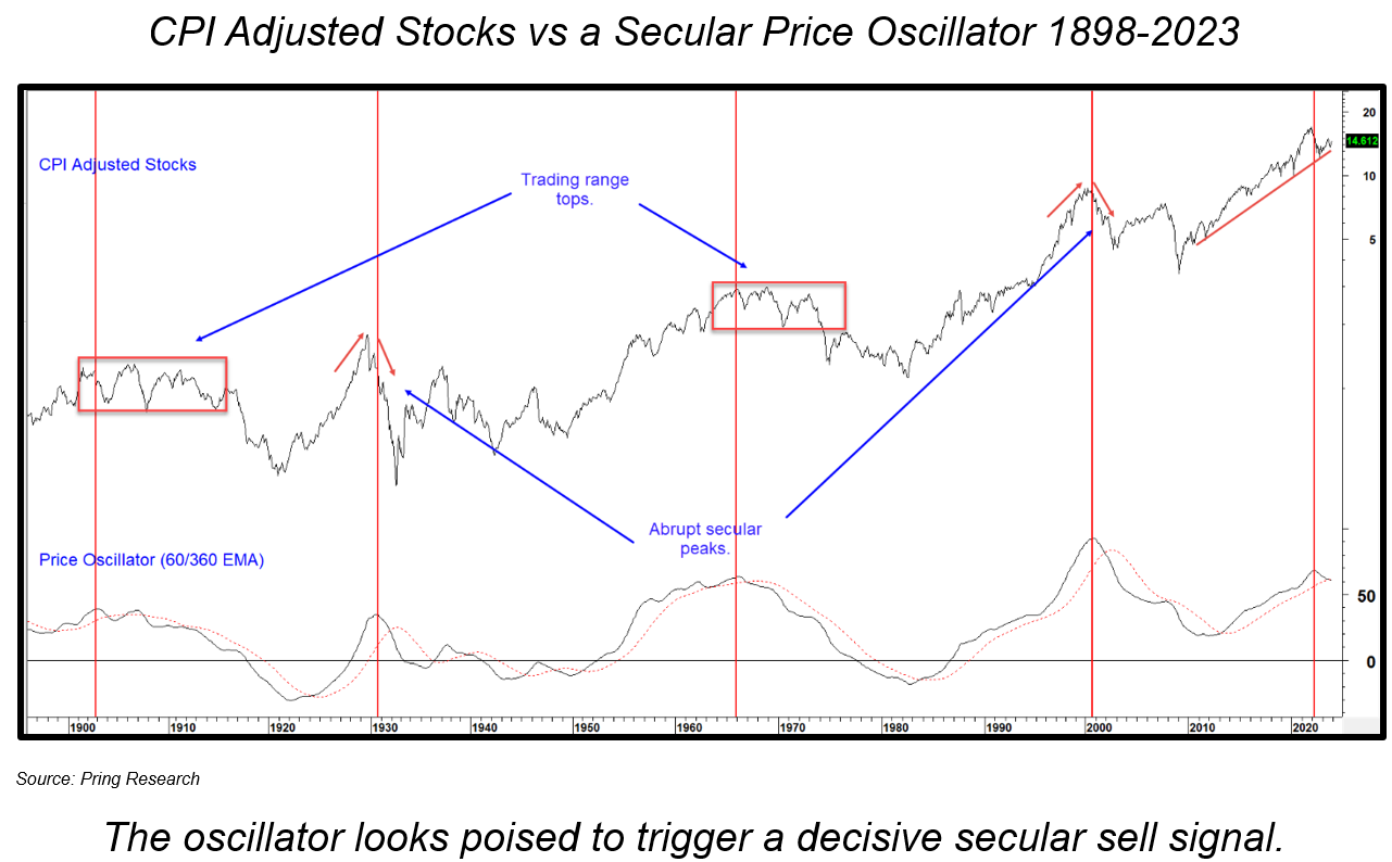
History informs us that the magnitude and duration of the average primary bull market depends greatly on two factors, the direction and nature of the prevailing secular, or very long-term trend. If it is down, counter-secular rallies tend to be smaller and take less time to evolve than if the secular price movement is positive. The second point recognizes there are two types of secular bear. One that begins abruptly, much as an inverted V and whose initial downside damage is severe. However, in terms of maximum downside these bears are relatively brief. Chart 4 sets the scene in that regard. Using inflation adjusted stocks as a benchmark, it took 3-years between1929 and 1932 and 9-years following the 2000 peak. The other form of secular bear starts as a negatively biased trading range, which accelerates to the downside much later in the cycle. These trading range bears started in 1900 and 1966 and ended 21 and 16-years later in 1921 and 1982.

The arrows in Chart 4 flag peaks in the price oscillator, which develop reasonably closely to the secular top in inflation adjusted stocks. Note that the actual secular high does not necessarily correspond with the start of the trading range.
The function of the oscillator is to give us an objective indication of the prevailing stage of the secular cycle. November’s reading shows it to be positioned at an historically elevated level and to have also crossed marginally below its 48-month MA. If the post financial crisis secular uptrend is still in force, then history tells us to sit back and relax, as the current bull market would have several more years in which to unfold and reach significantly higher levels. On the other hand, if a secular bear did begin in 2021 it is worth asking the question Where is the primary trend likely to go from here?
That will depend on a couple of factors. First, whether the secular bear is a trading range or inverted V type. There are three grounds for suspecting a trading range. First, as shown in Chart 4, the two varieties appear to alternate. The previous bear, between 2000 and 2009 was an inverted V, which suggests that if 2021 was the peak, inflation adjusted stocks should experience a trading range for the next few years.
Second, last year’s decline took 9–months and lost 25% in nominal terms. That’s certainly consistent with the 12-month 30% decline in 1902 and the 9-month 17% drop in1966. Compare those initial primary bear markets at the start of the two abrupt reversals in 1929 and 2000. The first, using nominal month end prices, was 80% over 3 years and the second a 46% decline between 2000 and 2002, which evolved over 26 months. Bottom line: last year’s decline is consistent with a trading range secular top.
A third point in favor of a rangebound scenario comes from the fact that the inverted V secular bears began under deflationary conditions, whereas the two range bound secular bears started off under an inflationary environment.
When and Where is the Post 2022 Bull Market Likely to Peak?
Working on the assumption that the 2022 decline was the opening salvo of a new secular bear we can state that the average gain for counter-secular primary bull markets in nominal terms between 1902 and 1921 was 51%, averaging 25-months. The rangebound 1966-1982 bears clocked in with a similar 43% and 22-months. Averaging them out would project an S&P 500 peak somewhere around next September at around 5,400. Ironically, such a projection would not be far from the inflation adjusted 2021 high. That’s certainly not a prediction, especially since we do not know the level of inflation over the next few quarters. It is more of a working hypothesis based on the assumption that December 2021 witnessed the start of a secular bear, which will inherit more of the characteristics of a rangebound than an inverted V variety. Don’t forget, the highest point in the two previous trading range bears was reached after the trading range began. That opens up the possibility of significantly higher nominal stock prices in 2024, just in time to lure in more bull market enthusiasts and entrap the unwary!
Learn how our unique approach and personalized advice can help you grow the value of your financial portfolio.


