
A major anxiety amongst stock market participants revolves around two key factors that appear to be on a collision course. The first is an overvalued stock market. The second, is an emerging trend of rising interest rates. We made the case for rising rates last year, but the question our financial advisors attempt to answer every strategy meeting is at what point in the cycle will interest rate increases, as they always do, adversely affect the economy, corporate profits and the stock market. That point could easily trigger a cyclical and painful stock market decline based on today’s overvaluation starting point. We will try to answer the question and share our observations through an investment checklist of three proven indicators that have been helpful in identifying previous stock market peaks. First though, let’s start with some ideas that you might think would work, but in reality do not.
What Does Not Work
In the last few weeks, several financial advisors have cited specific levels that might cause harm to equities. A 3% yield on 10-year treasuries comes to mind. Unfortunately, these predictions fall into the category of guesses rather than a forecast based on realistic financial analysis. Indeed, the level of rates, even when expressed in inflation adjusted terms, does not have any connection with the trend of stock prices. For example, the yield on 3-month commercial paper doubled from an elevated 8% in June 1980 to a stratospheric 16% six-months later. In that same period the S&P advanced from 114 to 133 for a 16% gain. On the other hand, that same yield rose from around 4.9% in March of 1999 to 6.7% in May of 2000. That’s a far smaller 36% advance over a greater period, which also ended with an interest rate peak that was less than half the 16% level achieved in 1980. Moreover, the stock market drop into the summer of 1982, following the doubling of rates, was a relatively mild 20%. That compared to the 45% decline between 2000 and 2002 on the back of that 36% rate hike. The point being, that there is no consistent relationship between stock market peaks and the level of rates, or the speed, magnitude and duration of their preceding advance.
The Three-Part Checklist
When assessing price trends in stock markets, it’s important to remember, that the key driving force is psychology, by which we mean investors attitudes towards the fundamentals rather than the fundamentals themselves. In that respect, Chart 1 features the Shiller PE, a financial valuation measure, which we think serves better when viewed as a reflection of sentiment. After all, if investors were willing to pay $43 for each $1 of earnings, as was the case in 2000, they were obviously very optimistic about the future. On the other hand, in late 1982, after well over a decade of falling inflation adjusted equity prices, pessimism was widespread. That was reflected in the price of that same dollar’s worth of earnings, which was then priced under $7.
There are two factors to consider when interpreting sentiment indicators, their level and trend. The current Shiller reading, just shy of 30 times has only been surpassed twice before. First, in in 1929, and more extensively, prior to the bursting of the tech bubble. History warns us that this is generally a dangerous environment in which to be holding stocks. However, the same could have been said in July of 1997, when the indicator was at a similar reading. That period was followed by a 2-year 48% inflation adjusted advance in the S&P. Markets are notable for their ability to overshoot, so the moral of the story, is that high levels should be used to warn of potential vulnerability but not for timing.
S&P Composite and the Shiller PE
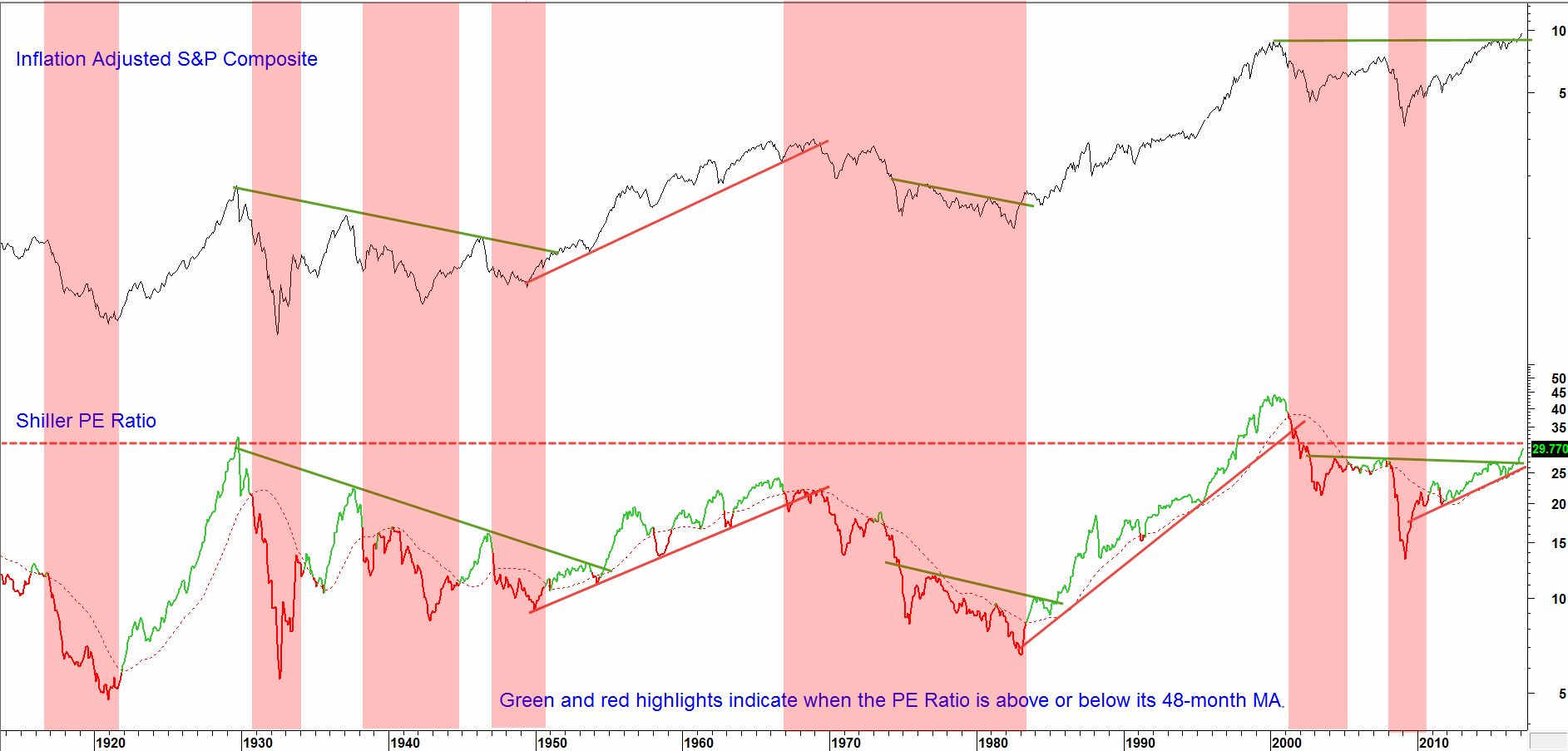
Source: www.econ.yale.edu/~shiller/data.htm, Reuters
Chart 1 Positive trends in the PE lead to higher stock prices
Thus, it is the trend of investor confidence that is paramount. Since the 1920’s it has been possible to construct four sets of trendlines for the price and PE. Each situation was followed by multi-year change in trend. A fifth set was recently violated on the upside. Moreover, the PE is currently in the “green” i.e. above its 48-month MA. This technical evidence suggests that the probabilities favor a continued move higher. As a cynic might put it, the probabilities favor the greater fool theory operating for a while longer.
On the other hand, we must remember that markets reflect crowd psychology and crowds can and do change their minds. In that respect, the signal indicating that rising rates are indeed having an adverse effect on equity prices, would come from a reversal in the uptrend of the PE. The signal to look for, would be a drop below its 48-month MA and 2009-17 up trendline. Both benchmarks are currently around the 25.5 level.
The second checklist item that can be used by financial advisors is featured in Chart 2. It compares inflation adjusted stock prices to a ratio between the Shiller PE and the 20-year government bond yield. The indicator reflects the relative popularity of stocks over bonds and vice versa. When the PE is rising at a faster rate than bond yields, the indicator advances. This tells us that that optimism in the stock market is outpacing the headwind effect of higher interest rates. The pink horizontal band represents the zone of (stock market) death. It comes into play, when the indicator reverses from within or above this area, subsequently experiencing a decisive drop below it. These technical events have been flagged by all of the thin, and two of the thick red arrows. Some signals have been tardy, such as that triggered in 1946. Others, flagged by the dashed arrows, have been failures. By-and-large though, this approach has consistently indicated when rates have risen sufficiently to spook equity investors.
Finally, the six thick red and green arrows draw our attention to those situations when the ratio has violated a long-term trendline and a secular reversal has followed. The current up trendline, dating from 1982 is still intact. It is currently intersecting with the lower end of the zone of death. That means that when this level is eventually breeched, it will signal both a cyclical and secular decline in this relationship. The lower level of that zone is at 7, and the ratio is calculated by dividing the monthly Shiller P/E by the month end 20-year Yield.
Inflation Adjusted Equities and the Shiller PE/20-year Govt Yield Ratio
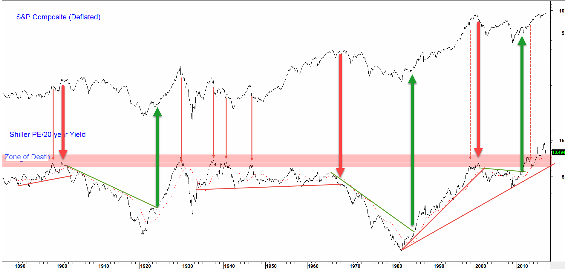
Source: www.econ.yale.edu/~shiller/data.htm, Reuters
Chart 2 When the stock/bond ratio crosses below the zone of death, equities are usually in trouble
The third item on the financial advisor checklist compares the total return between stocks and cash. To calculate this, the dividend yield on the S&P is added to its 10-month ROC. The result is then subtracted from the yield on 3-month commercial paper, our cash proxy. When the indicator is above zero it is considered positive for equities and vice versa. The green and red highlights in Chart 3 reflect the bullish and bearish periods. One observation is fairly obvious and another less so. First, this total return model has signaled all of the major declines since 1900 at a relatively early stage. Second, while an initial glance suggests that the indicator works perfectly well, careful examination will reveal several false negatives and positives, where it went bullish or bearish for a very short period of time. These instances have been flagged with the small red and green dashed arrows.
Both the indicator and its 9-month MA are currently in a rising trend, so the total return earned from the S&P is not in danger of being outpaced by that for cash. When it reverses trend and crosses below zero that will be the time to become concerned.
S&P Composite versus the Total Return Model
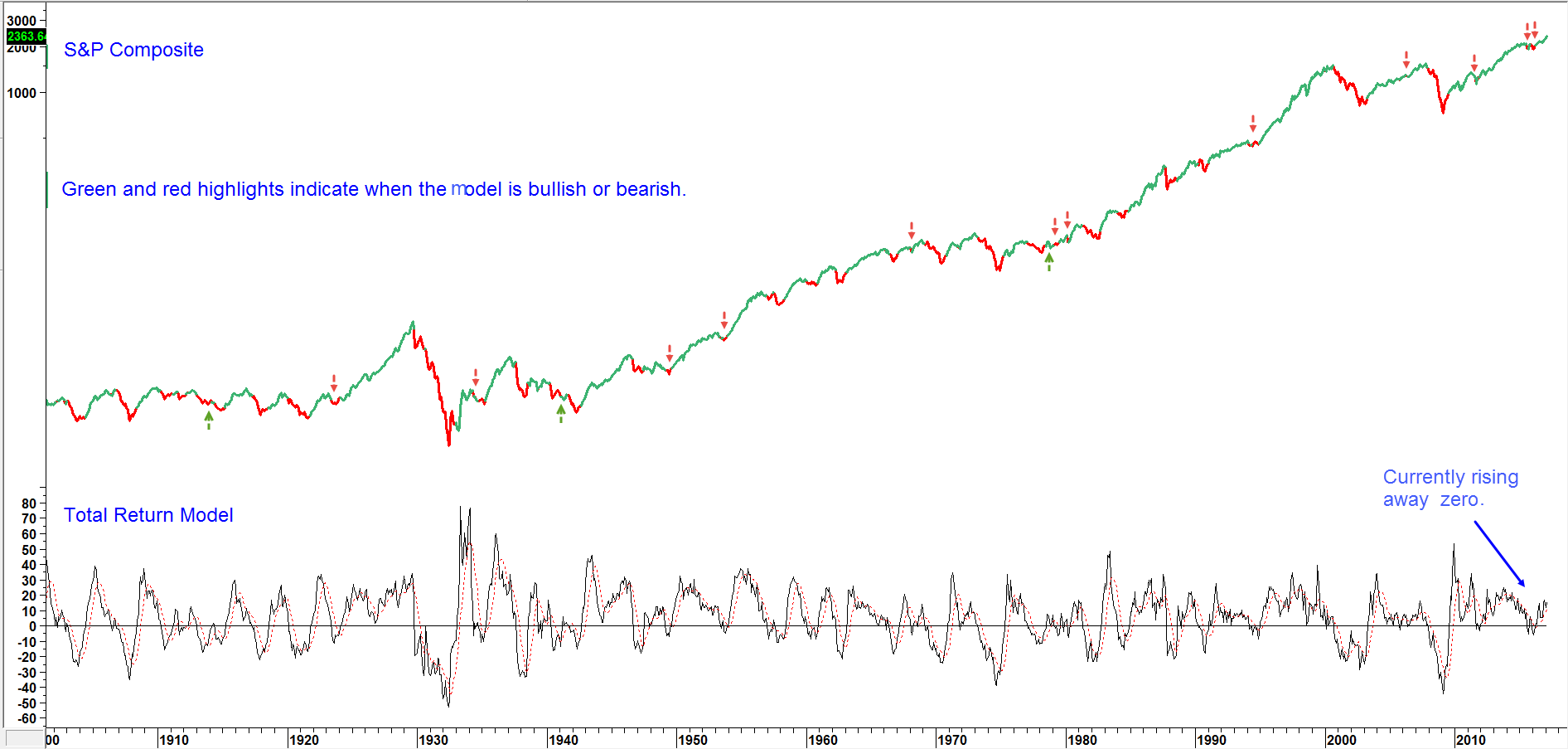
Source: Pring Research, Reuters
Chart 3 The model is moving away from zero and is therefore bullish.
Conclusion
The market has been rising on its typical “wall of worry” in the last few months. Among other things, that wall is constructed from a combination of overvaluation and rising interest rates. We are working on the assumption that rates will continue to trade higher, and recommend following the trend of the Shiller PE, together with its relationship with the yield on 20-year treasuries. Even if we have already seen the peak in yields, and rates drop from here, those benchmarks would still be valid if triggered. That’s because their achievement would indicate that rates had already risen enough to adversely affect investor sentiment, thereby triggering a bear market in equities.
Has the Stock Market Advanced Too Far, Too Fast?
Disclaimer: Pring Turner is a Financial Advisor headquartered in Walnut Creek, Ca and is registered with the Securities and Exchange Commission under the Investment Advisers Act of 1940. The views represented herein are Pring Turner’s own and all information is obtained from sources believed to be accurate and reliable. This information should not be considered a solicitation or offer to provide any service in any jurisdiction where it would be unlawful to do so. All indices are unmanaged and are not available for direct investment. Past performance does not guarantee future results.