
US stock prices are currently reflecting an exceptionally high level of confidence. Certainly much higher than when we wrote our August 2016 article Stocks Are Breaking the Glass Ceiling: 6 Reasons to be Bullish. Hard evidence of this euphoria comes from the latest preliminary inflation adjusted Shiller P/E, which is a cyclically adjusted price to earnings ratio, commonly known as CAPE. It is currently at a reading of 33.2, which is slightly above the 1929 peak of 32.6. It has never been higher, except for the last 18-months of the tech boom and the subsequent initial drop. To emphasize this point, the shaded areas in Chart 1 show the only period when the P/E and inverted S&P dividend yield have been higher than they are today.
Moreover, in mid-January, Investors Intelligence reported that the spread between bullish and bearish newsletter writers was at its highest level since April 1986. One is certainly justified in concluding that these elevated levels of valuation and optimism offer an unattractive reward/risk ratio. While not disputing the dangers of such extreme readings, we believe that trend is a more important factor, as markets often reach dangerous levels yet still overshoot. It’s also important to bear in mind that sentiment during bull markets is usually a leading indicator. For example, the market did not reach its 1987 peak until seventeen months after the April 1986 extreme reading from Investor’s Intelligence.
Stocks are most vulnerable when optimism is at an extreme and its long-term trend reverses. This is when careless investment decisions are exposed, as well. Right now, the P/E is well above its 48-month MA and secondary up trendline, and is showing no signs of weakness. The sharp drop in early February, is a timely reminder that a downturn could happen at any time. Two other “glass ceilings” though, are currently in the process of being cracked and suggest that what is currently risky may soon become more so.
Chart 1 Inflation Adjusted Stocks versus Two Valuation Indicators – 1890 – 2018 Click Chart to Enlarge (Sources: Reuters, Martin Pring’s Intermarket Review, www.econ.yale.edu/~shiller/data.htm/)
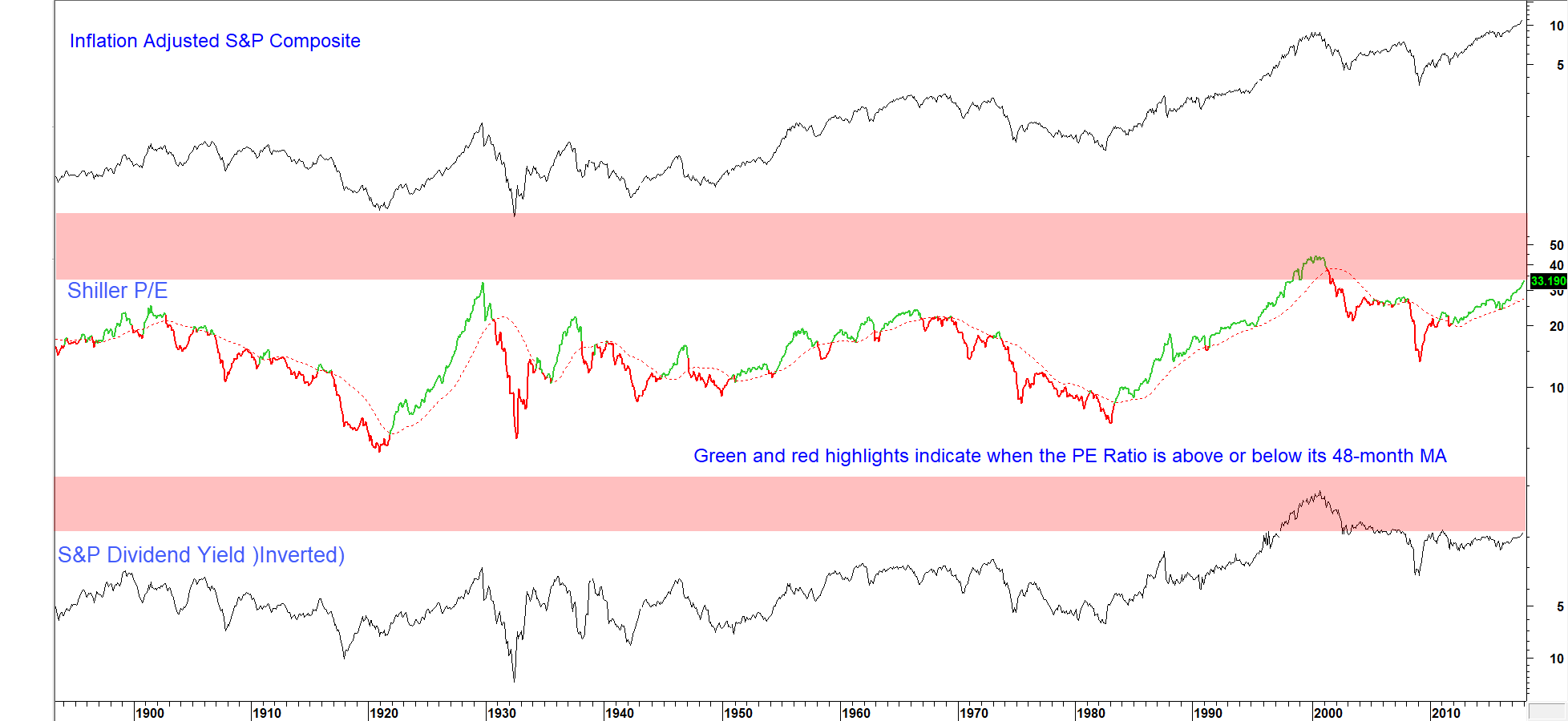
The Shiller P/E and inverted dividend yield are close to historic levels but their trend is still up.
Two important long-term breakouts
The first is displayed in Chart 2, which compares the inflation adjusted S&P Composite to the ratio between US market cap and GDP. Since the mid-1970’s, the Wilshire 5,000 has been used as the equity component. Prior to that, we substituted the S&P and Cowles Commission Indexes. The key takeaway from the chart lies in the fact that the ratio has recently broken out above a 140-year downtrend. Unless it quickly reverses, the breakout will likely result in a significant extension to the recent rally. Supporting evidence comes from the fact that the price oscillator for this relationship is also on a positive trajectory.
Chart 2 Inflation Adjusted Stocks versus the Market Cap/GDP Ratio 1880 – 2018 Click Chart to Enlarge (Sources: Reuters/Martin Pring’s Intermarket Review)
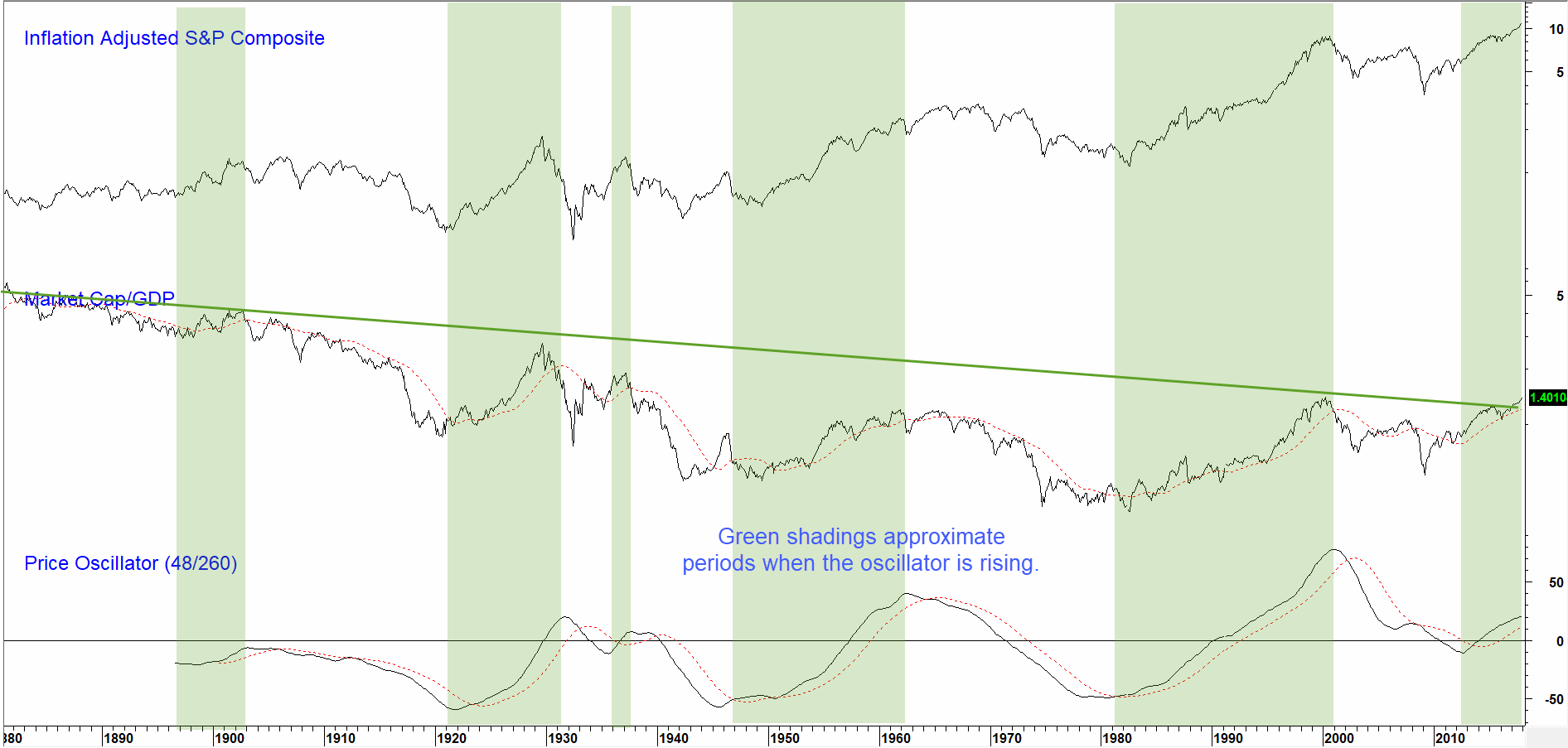
The Market Cap/GDP ratio has recently broken out above a 140-year downtrend. Unless it reverses, this is signaling an extension to the rally.
Chart 3 considers the level of FINRA sourced margin debt to GDP. This indicator has a good history of calling major market turning points. Trend is again considered to be a more useful guide than level, because the ratio has taken on bullish secular trend characteristics since the 1970’s. Moreover, up and downside trend reversals have corresponded with cyclical trends in the equity market. In this respect, the red and green arrows show that trendline violations of the ratio have offered useful reversal indications for both margin debt levels and the S&P Composite. Fast forward to the present situation and you can see that the ratio has broken above a 17-year resistance trendline connecting the four previous tops. Note that long-term momentum is also in a rising mode. This mega breakout implies that the trend of rising confidence, as reflected in this relationship, will extend for some time to come.
It’s fairly evident that the current elevated level of confidence, expressed by the Shiller P/E and other indicators, render these two breakouts vulnerable to a whipsaw. In that respect, the next three charts are worth monitoring because they reflect trends in risk taking and are poised to confirm these two glass ceiling breakouts with historic ones of their own.
Chart 3 S&P Composite versus Margin Debt to GDP 1960 – 2018 Click Chart to Enlarge (Sources: Reuters/FINRA/Martin Pring’s Intermarket Review) Click Chart to Enlarge
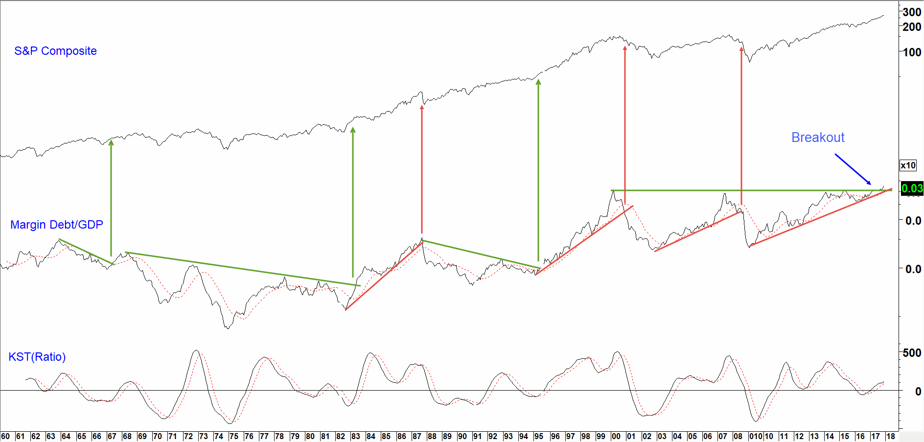
The ratio has just broken above a multi-year resistance trendline. This suggests that investors are willing to take on more risk.
Three confidence indicators are breaking to the upside
The first, a bond market relationship, is featured in Chart 4. It compares the performance of the 20-year government to Moody’s Baa corporate bond yield. Both series can be monitored at the St Louis Fed web site. When the ratio is rising, it means that investors favor the higher risk, higher yielding Baa instruments over the safety of government bonds. With the benefit of hindsight, periods of rising confidence, which represent a positive environment for stocks, are shaded in green. The ratio has been trading below a 10-year resistance trendline for most of 2017. A positive intermediate momentum indicator (KST) hints that the recent tentative upside breakout will soon turn into a decisive one. Given the length of the line, that would confirm a major bump in confidence is underway.
Chart 4 S&P Composite versus a Credit Spread 2000 – 2018 Click Chart to Enlarge (Sources: Reuters/Martin Pring’s Intermarket Review)
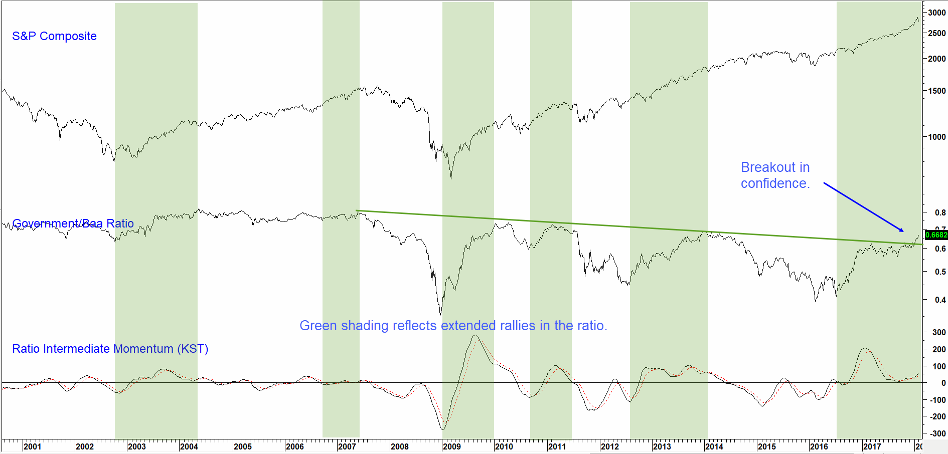
When the ratio is rising confidence is improving and so are stock prices.
Chart 5 compares the performance of the Fidelity Capital and Income Fund relative to the Vanguard Treasury Fund. The former invests in high yielding stocks and bonds and the latter, high quality government paper. Again, a rising relationship reflects growing confidence and vice versa. Green shading indicates periods when the ratio is experiencing a sustained uptrend. All are shown to be beneficial for equities in the top window. This relationship is currently pushing through a major 20-year resistance trendline: no small barrier. Noe that its long-term smoothed momentum has started to re-accelerate to the upside.
Chart 5 S&P Composite and a Confidence Indicator 1987-2018 Click Chart to Enlarge (Sources: Reuters/Martin Pring’s Intermarket Review)
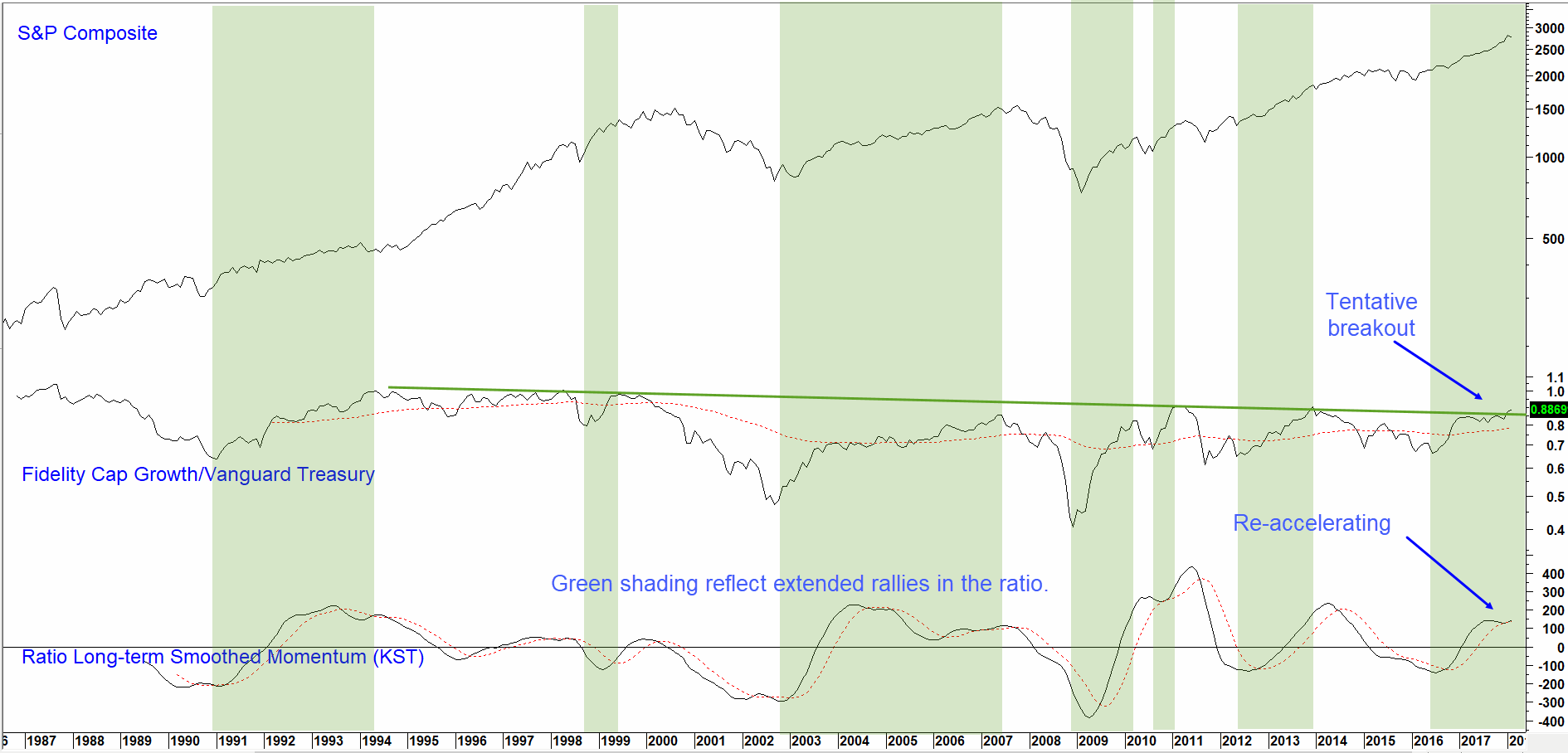
A rising ratio means confidence is improving and so, too, are stock prices. This series could be poised for a mega breakout.
Our final relationship is a composite of our Risk-On and Risk-Off indexes, pictured on the bottom of Chart 6. Risk-Off contains defensive vehicles such as utilities, gold, the Japanese yen, etc.. On the other hand, Risk-On is an index comprising more aggressive entities, such as resource based equities, small cap stocks and so forth. Once again, the green shaded areas flag sustained ratio advances, an environment that has been consistently favorable for stocks. This series has also just broken above a 10-year down trendline.
Chart 6 S&P Composite versus a Risk On/Risk Off Ratio 1990 -2018 Click Chart to Enlarge (Source Reuters/Martin Pring’s Intermarket Review)
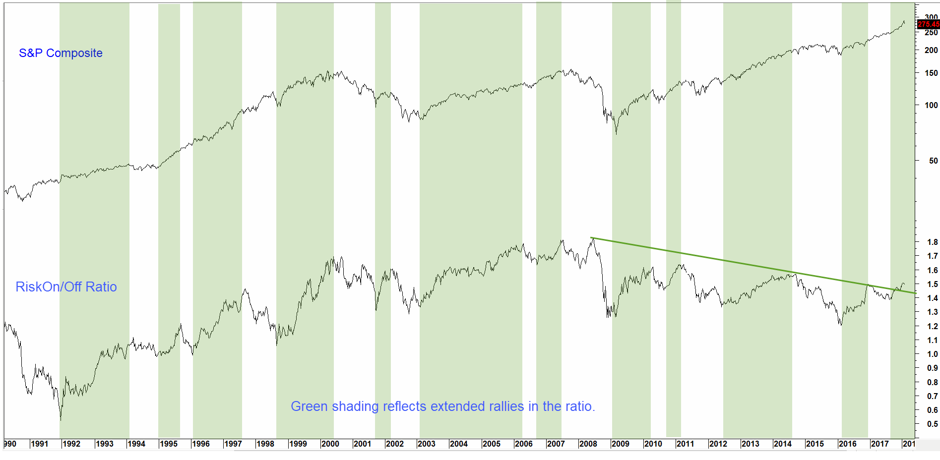
The Risk On/Off ratio is edging through a major resistance trendline. A successful violation implies growing confidence a rising stock market and a turn to riskier assets.
Implication of these breakouts
Putting aside the fact that valuations and sentiment are at dangerous extremes, the evidence shows that the Market Cap/GDP and Margin Debt/GDP ratios have broken above their respective multi-year glass ceilings. That suggests that stocks themselves will continue to rally into an even more risky environment. Supporting evidence indicates that the three described ratios have tentatively pushed through significant long-term resistance. Moreover, that point is reinforced by the fact that each relationship approaches the problem from a different aspect but comes to the same conclusion. These are a bond market credit spread, a stock bond ratio and, through the Risk-On/Off relationship, a multi-asset and internal stock market ratio.
Figure 1 Typical Business Cycle Sequence Source: Pring Research
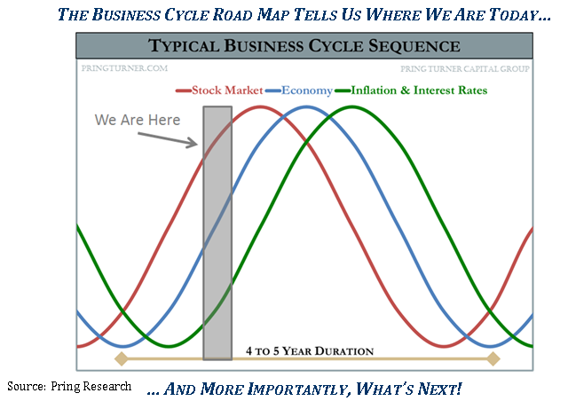
Trends in equities, the economy and interest rates suggest we are at a mature phase of the cycle.
No one knows for sure how far along we are in the business cycle. However Figure 1, which was included in our recent quarterly newsletter to clients and sub-advisors, offers an educated guess. The gray shaded area certainly reflects the current environment. Stock prices have been strong, economic momentum is building and interest rates and inflation are finally turning up from very low levels. All three are rising simultaneously! This, in addition to weakness in the utilities and strength in resource stocks, indicates that the business cycle has reached a mature phase of its development. According to our gray shaded estimate, upside potential may be limited in terms of time. But don’t forget, the final six months of the tech boom saw the NASDAQ almost double. Things may move a long way in a very short period of time at the end of the cycle!
There could be a price to pay for cutting back and being too early, but there’s an even bigger one for not having a bear market game plan in place. You can stay tuned to our investment changes as this bull market ages by signing up for updates at pringturner.com.