
A large part of the Pring Turner investment approach is derived from the fact that the business cycle is nothing more or less than a repetitive chronological sequence of events. The cycle begins with a bottoming in the interest sensitive housing industry and ending with a pick-up in capital spending caused by capacity constraints in manufacturing. Fortunately for us as active investment managers, the primary trend turning points for bonds, stocks and commodities are also part of the sequence. We call it the seasonal approach to asset allocation since the business cycle, like the calendar year, goes through different seasons. For farmers, there are certain seasons, such as winter, when it’s time to rest but prepare for the spring planting season, and of course during summer and fall is when harvesting is the preferred task.
Allocating assets around the business cycle is similar in many respects. There is a deflationary season, when it’s time to play defense by emphasizing bonds and conservative equity sectors. Later in the cycle, when capacity tightens and commodities are running higher, it’s time to purchase earnings driven equities for our separately managed portfolios.

Figure 1 features an idealized growth path for the economy. It pinpoints the expected highs and lows for bonds (B), stocks (S) and industrial commodities (C). In the 1920’s, Joseph Kitchin identified the 41-month cycle in business activity that bears his name. Since the 1960’s though, there have only been seven recessions. That puts the trough to trough cycle closer to a 100-month cycle and suggests the 41-month span is no longer operative. On the other hand, including growth slowdowns into the mix expands the number of post 1960 cyclic events to seventeen. That translates to about 42-months. The Kitchin cycle then, is alive and well.
Our models, which identify the primary trend of bonds, stocks and commodities, suggest that the cycle is currently positioned somewhere in the green shading. Using the low in bonds as the start of the cycle (Stage I) and progressing forwards to the bottom of stocks (Stage II), the next event to look for is a low in commodities (Stage III). However, the economy is not emerging from a recession as indicated in Figure 1. Instead, it appears to be emerging from a growth slowdown or economic soft landing.
During growth slowdowns the chronological sequence of market turning points still operates. The principal difference, is that the magnitude and duration of the cycle’s “down” part is far less volatile than a typical recession. It also means that, the chronological sequence of financial market turning points are sped up.
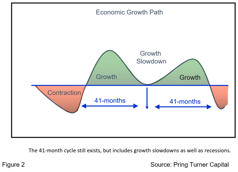
It is not unusual to see recessions separated by two slowdowns, but our work indicates that the US economy is currently emerging from an unprecedented third one since the 2008-9 financial crisis (see Figure 2). Since bonds bottomed in October of 2018 and stocks hit their low water mark two months later in December 2018, the next cyclic event should be a turning point for industrial commodity prices if one has not already taken place.
There are several areas to consider when identifying a primary trend reversal in commodity prices. In this respect, we need to recruit help from the global economy, as well as bond, stock, and currency markets, not to mention the internal technical picture of commodities themselves.
Global Economic Momentum Could Be Reversing
Commodity prices are determined by swings in the global supply/demand relationship. It is difficult to come up with an aggregate measure of supply or demand. However, it is possible to use swings in the global economy as a proxy for the demand side. In that respect, Chart 1 compares the CRB Spot Raw Industrials to an oscillator of a global LEI. When the economy picks up so too do commodity prices. The vertical lines show when the oscillator crosses above zero. Sixteen signals can be identified since 1972. With the notable exception of late 1980 and 1991, all have been followed by a commodity bull move or extended trading range. Note that even the failed signals quickly reversed to the downside, thereby canceling the positive ones before any real harm was done. It looks like this indicator bottomed in mid-2019 and, based on its current trajectory, is pretty close to a seventeenth positive signal. That should not be surprising, given the massive amount of US monetary and fiscal stimulus and early 2020 monetary accommodation from China.
Chart 1 CRB Spot Raw Industrials vs the OECD LEI 1969-2019
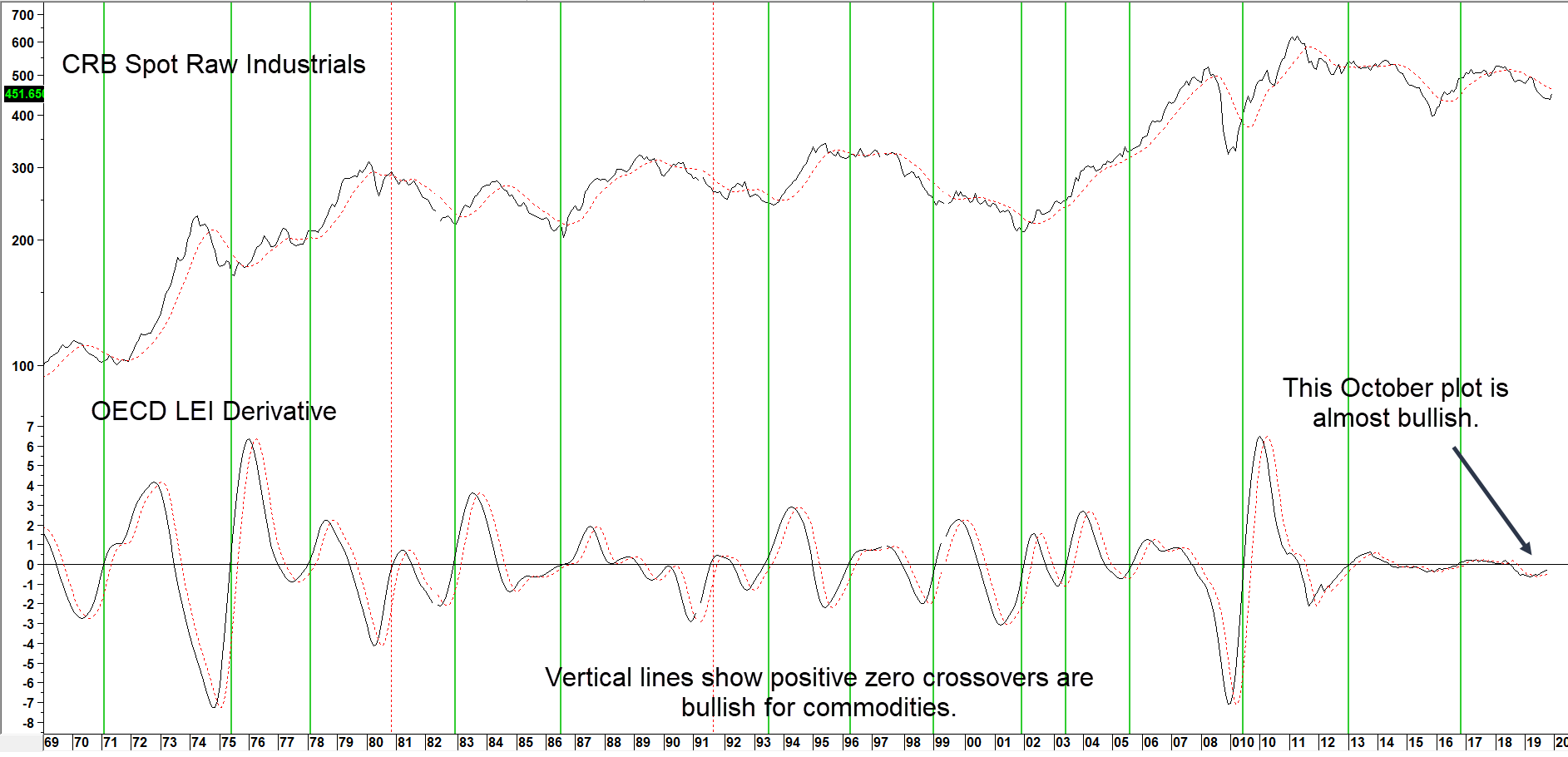
Source: Martin Pring’s Intermarket Review
Upside reversals in the global economy mean higher commodity prices ahead. (click chart to enlarge)
A Bond Market Vote of Confidence
Swings in confidence can be measured in many ways, but one of our favorites is a credit spread expressed in the form of long-term smoothed momentum. One key measure is the ratio between the 20-year Government and Moody’s Baa Corporate yield. When the ratio is in a rising mode confidence is improving. That’s because bond investors are focusing on higher yields compared to greater safety, as they anticipate a strong economy will result in fewer defaults. Not surprisingly, lows in this momentum series are often associated with bear market bottoms in commodity prices. Recent examples have been flagged by the arrows. Like everything else, it’s not a perfect indicator, but has worked pretty well since 2002. December saw it, together with a similar relationship between the iBoxx High Yield and iShares 7-10-year Treasury ETF (HYG/IEF), hook to the upside for the seventh time this century. In short, bond investors are expecting a firmer economy and that should translate to higher commodity prices.
Chart 2 CRB Spot Raw Industrials vs Credit Spread Momentum 2001-2019

Source: Martin Pring’s Intermarket Review
Upside momentum reversals signals a new bull market for commodity prices (click chart to enlarge)
The Stock Market Weighs In
Referring back to Figure 1, it is possible to divide the cycle into an inflationary and deflationary part. The inflationary part approximates the time when commodities are bullish and the deflationary segment when they are bearish. We have tried to replicate this in the equity market by constructing an index for inflation (miners, energy etc.) and deflation (utilities, REITs etc.) sensitive industry groups. It is displayed in the center window of Chart 4. A quick comparison between the CRB Composite and the ratio shows a strong connection between swings in the Inflation/deflation ratio performance in the stock market and commodity prices themselves. The vertical arrows show sub-zero upside momentum reversals. All were followed by an advance or trading range of some kind. The only failure, which we have labeled “Big bad 1”, developed in 2014 and was followed by a penetration of the solid red trendline and really sharp decline. Another buy signal was generated in December, which should also lead to higher prices. However, if momentum were to now reverse with an accompanying drop below the red trendline, it would suggest the unraveling of a “Big bad 2”. That’s an unlikely event, especially as both series have experienced major down trendline breaks, but it’s better to be psychologically aware of the unexpected.
Chart 3 The CRB Composite versus the Inflation/Deflation Ratio 1979-2019
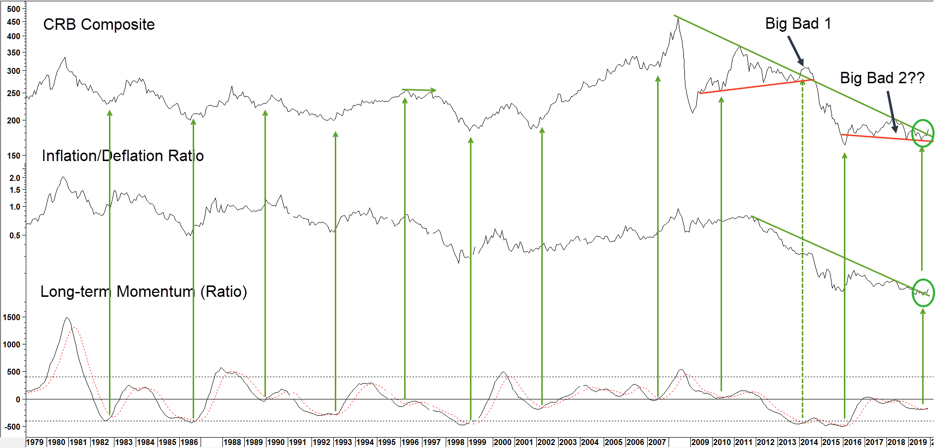
Source: Martin Pring’s Intermarket Review
The momentum buy signal for the ratio argues for higher commodity prices. (click chart to enlarge)
The Dollar and Commodity Prices
It’s a well-known fact that the dollar and commodities move inversely most of the time. December saw some tentative signs the currency may be peaking, but there is not yet sufficient evidence to be conclusive on this. What we can say though, is that there is an even stronger link between the performance of the Canadian dollar and commodity prices than the Dollar Index itself. Here, the evidence of a bottom is far more compelling. Chart 4, shows that broad swings in the CRB Composite are matched fairly closely with those for the Canadian buck. Moreover, the green arrows demonstrate that momentum buy signals for the currency have represented excellent opportunities for the acquisition of commodities. Since that currency momentum has started to reverse to the upside, we should expect to see recent breakouts by both the Index and the Canadian dollar become more decisive and with that a vote for higher prices.
Chart 4 CRB Composite vs the Canadian Dollar 1983-2019
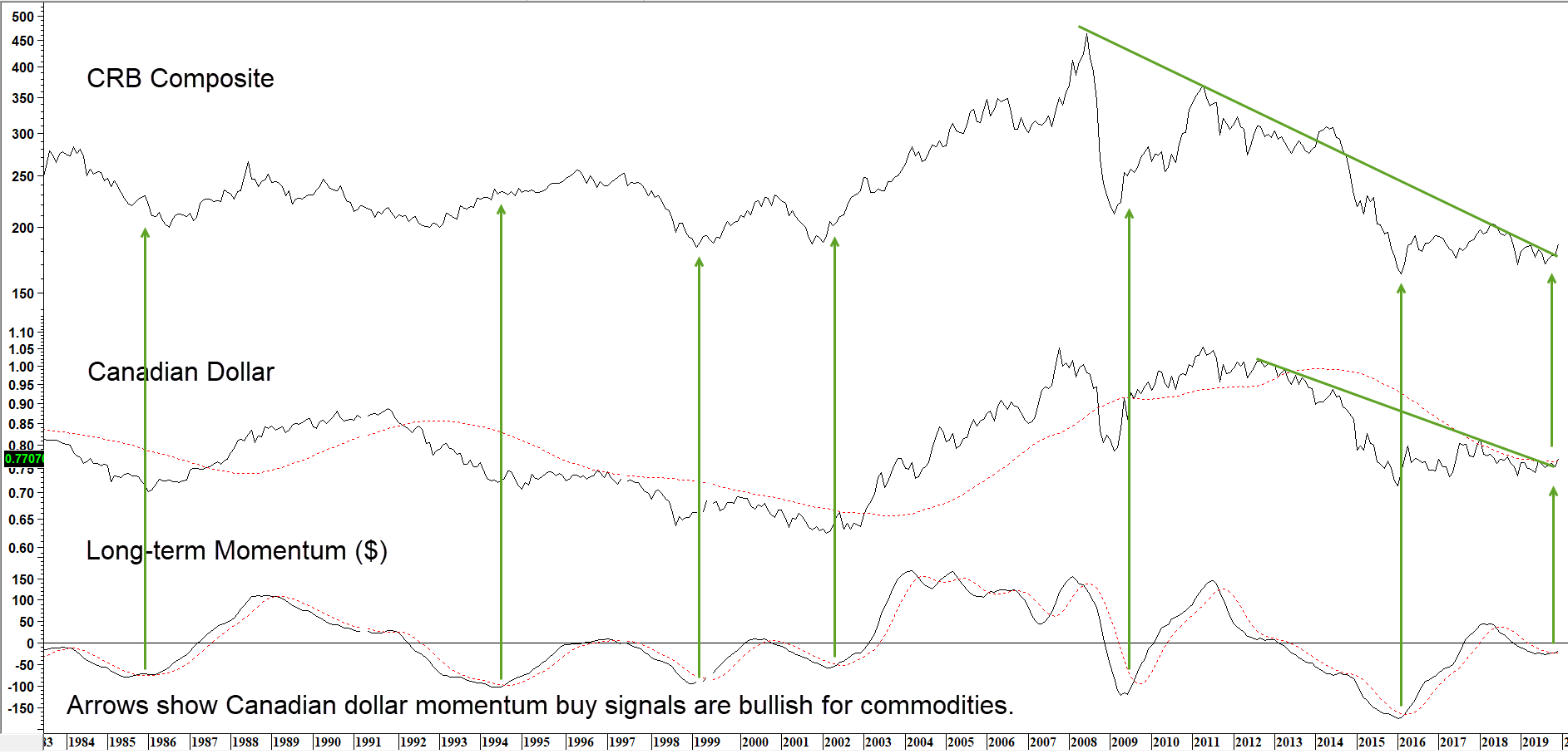
Source: Martin Pring’s Intermarket Review
When this commodity sensitive currency rallies surprise, so do commodities. (click chart to enlarge)
The Long-term Technical Position Suggests Commodities are Bottoming
The arrows in Chart 5 show when the 15-month rate of change (ROC) for the CRB Spot Raw Industrials touches or falls below its green oversold line and subsequently crosses its (red dashed) 9-month moving average (MA). With two exceptions, in 1991 and 1999, all instances were followed by a nice rally or extended trading range. December saw the indicator cross its MA and also violate a three year down trendline for a solid reversal. That strongly suggests the ROC has bottomed and with it commodity prices.
Chart 5 CRB Spot Raw Industrials and a 15-month ROC 1955-2019
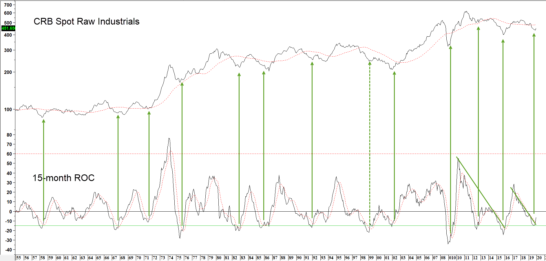
Source: Martin Pring’s Intermarket Review
The ROC looks like it is reversing again, signaling a potential new bull market.(click chart to enlarge)
Conclusion
Always being alert and anticipating the next inflection point in the business cycle can help you actively manage your investments while taking advantage of emerging profit opportunities and more importantly protect your wealth from the inevitable cyclical declines. This exceptionally long business cycle appears set to emerge from its third growth slowdown and has now reached the stage where a cyclical bull market in commodities can be expected. We are prepared to make timely adjustments to our investment portfolios to take advantage of this potentially inflationary environment. Make sure you don’t miss out on any updates to our business cycle research by signing up for our email list at our website and by reading future Advisor Perspective articles.