
Even though there has been no recession for 10 years, students of the business cycle know that it is still alive and well. Instead of a full-blown contraction in business activity, the last decade has seen the US economy experience two mid-cycle growth slowdowns and subsequent recoveries. A third slowdown has been underway for the last year, begging the question of whether it will morph into a recession or transition into a fourth growth phase of this extended economic expansion. We raised this question in January in an article entitled “A Slowdown is in the Bag, but What About a Recession?” Since then, several forward-looking indicators have extended their corrective phase and edged closer to recessionary territory. Many financial market observers have been quick to jump on the recession bandwagon, but we did not see compelling evidence to make that call for the client portfolios we manage at Pring Turner. In fact, many reliable indicators have started to perk up from levels that have traditionally warded off contractions in business activity. So far, this selective firming is somewhat tentative. If renewed economic growth is for real, we would expect to see the equity market discount the good news and continue to rally. In order to get a better grasp on things, let’s first take a quick look at the economy by putting the visible green shoots in perspective. Subsequently we will examine the equity market’s long-term technical position to see whether there is a solid case for another up leg in the 2009-20?? bull market.
Latest Data Argue for an Economic Bounce
Chart 1 characterizes the recent growth slowdown and tentative recovery. It features the Chemical Activity Barometer (CAB), a leading economic indicator published by the American Chemistry Council. We like it because this indicator has peaked ahead of every recession (highlighted in red) since the 1920’s. Moreover, it is usually relatively deliberative in its trajectory, i.e. not subject to numerous false signals. The lower panel displays a price oscillator constructed by dividing a 3- by an 18-month moving average (MA). Negative zero crossovers, occur fairly consistently close to the onset of a recession. These instances have been flagged by the red vertical lines. The two post 2009 and current slowdowns have been identified by the dashed blue arrows, and the subsequent recovery period by the solid ones.
Chart 1 The Chemical Activity Barometer and a Momentum Indicator 1968-2019
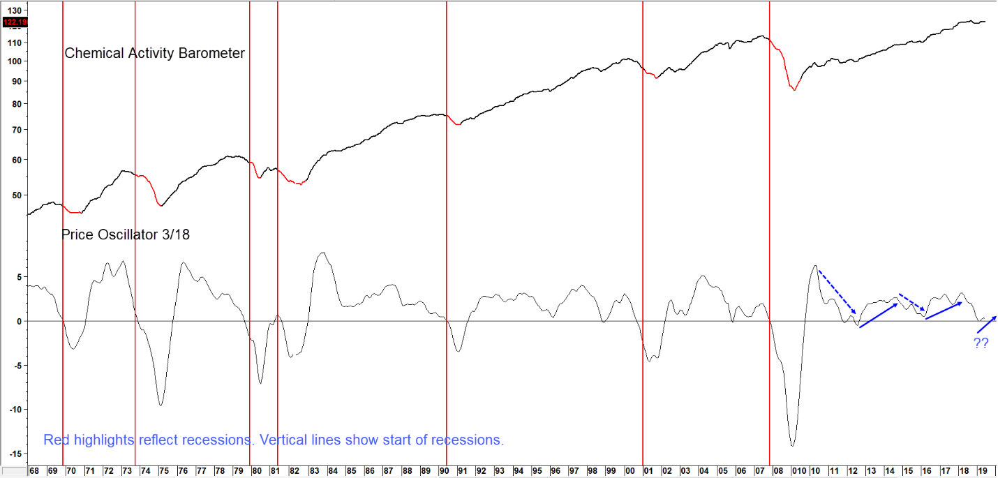
Sources: American Chemistry Council, Pring Research
The momentum of Chemical Activity Barometer has bounced from the “recession” line…Perhaps Signaling Another Extension to This Rather Long Business Cycle Expansion. (click chart to enlarge)
The green arrows in Chart 2 have been inserted at points when the oscillator looked as if it was about to signal a business cycle contraction but rallied instead. These turnarounds signaled that the slowdown had ended, a recession averted and that a stock market rally was in a relatively early stage.
Chart 2 S&P Composite vs Chemical Activity Barometer Momentum 1992-2019
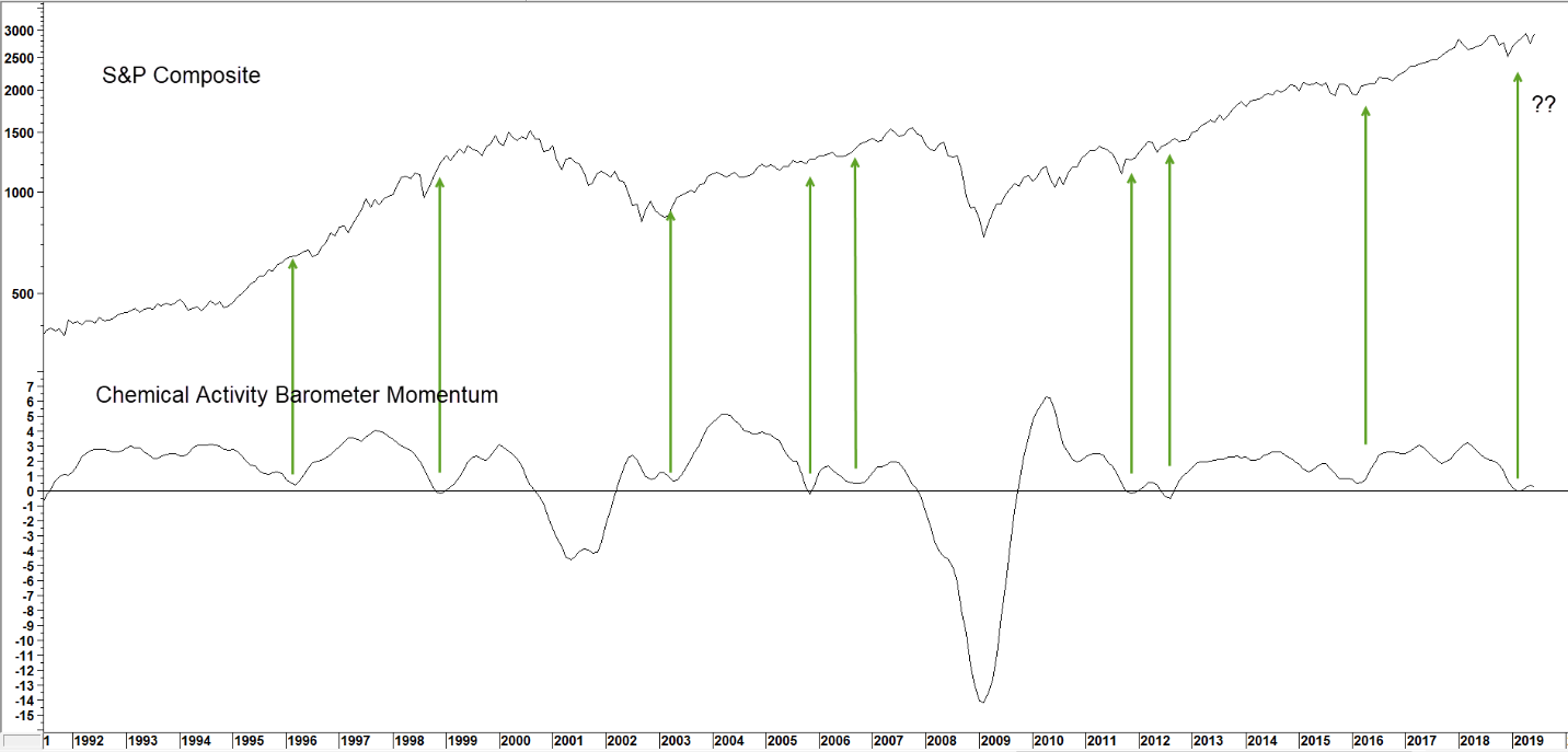
Sources: American Chemistry Council, Pring Research, Reuters
Upside reversals in the CAB oscillator from around zero represent great buying opportunities for stock investors. (click chart to enlarge)
Fast forward to the present, where it looks like another turnaround may be in the works. Since previous reversals have represented excellent buying opportunities for stocks, let’s quickly review some equity market indicators to see if they agree.
Long-term Stock Market Indicators
Chart 3 features one of our favorites, the Financial Asset Velocity indicator or FAV. It essentially reflects the sensitivity of financial markets to swings in the amount of liquidity being injected or drained from the financial system. This is achieved by calculating and combining long-term smoothed momentum for the three main financial markets: bonds, stocks and commodities. A rising FAV means that sufficient liquidity is being pumped into the system to be consistent with rising stock prices and vice versa.
At the beginning of the cycle the economy is in recession or slowdown mode. That’s the stage when the central bank injects liquidity into the system, causing interest rates to fall and bond prices, one of the ingredients of the FAV, to rise. When the stock market senses that economic conditions are set to improve, as a result of easy money, its trend of declining momentum reverses or dissipates. That’s usually sufficient for the FAV itself to bottom out and begin a new cycle. The vertical lines in Chart 3 show periods when the Indicator has crossed above its MA from a position at or below zero. The vast majority of instances have been followed by a strong equity rally. Since such reversals have rarely if ever been subject to whipsaws, we see no reason why June’s buy signal will not prove to also be a valid one.
Chart 3 S&P Composite and Financial Velocity 1952-2019
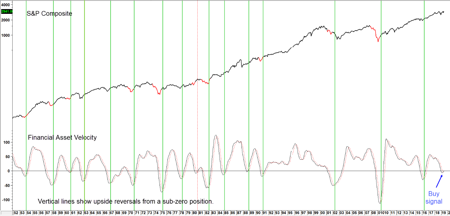
Sources: Pring Research, Reuters
Upside reversals in the FAV typically signal the start of a new bull trend for stock prices.(click chart to enlarge)
Chart 4 looks at the technical position from a different aspect. The indicator in the lower window monitors a universe of S&P industry groups whose long-term smoothed momentum is both declining and below zero. We call this the “Winter” position, as it’s as bearish as the indicator can get. When this number maxes out for the cycle and starts to decline it indicates that more and more industry groups are transitioning into the “Spring” position, a phase where they are experiencing “green shoots” and rising momentum. Such action typically signals that a stock market bottom is being formed.
Generally speaking, the higher the peak, the greater the potential for upside activity. That’s because a high reading reflects the fact that a significant number of groups have undergone corrective activity, thereby building the foundation for a new bull market. The latest June data tell us that the indicator, having reached a moderately elevated level, has now started to decline. Based on the success of 16 of the 18 reversals that have taken place since the 1960’s, the odds of a significant extension to the recent rally are high.
Chart 4 S& P Composite and Winter Industry Group Momentum 1958-2019
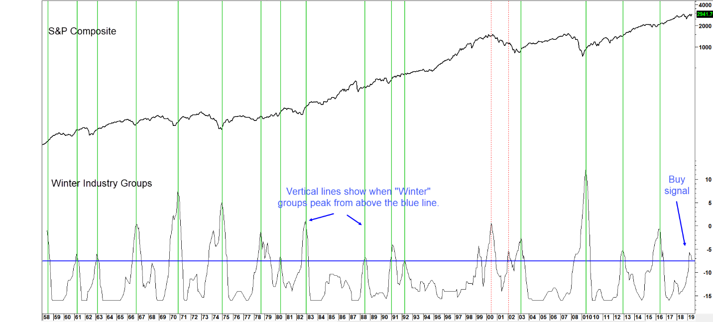
Sources: Pring Research, Reuters
When the number of industry groups in “Winter” position reverses from an elevated level stocks rally. (click chart to enlarge)
Charts 5 and 6 feature the S&P Composite along with a ratio that compares the current return on stocks, via the Shiller P/E, to that of bonds, in the form of the government 20-year yield. A rising relationship means that stocks are favored over bonds and vice versa. Historically, a reading in excess of 7.5 has proven too rich for stockholders and equities have succumbed to a primary bear market. Since 2014 the record books have been cast aside, as the love affair with stocks has pushed their relative valuation, as monitored by this relationship, to record levels, well above the 7.5 warning level. This is not unlike the final years of the tech boom when some valuation levels reached stratospheric levels and stayed there for several years. The current elevated reading is therefore warning us that we have already reached the snowline of the equity mountain. The late 1990’s though, proved that market psychology can be stretched beyond reasonable parameters for extended periods of time.
Chart 5 S&P vs the Shiller PE/20-Year Govt Yield Ratio 1880-2019
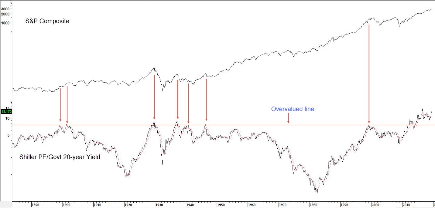
Sources: Pring Research, Reuters, www.econ.yale.edu/~shiller/data.htm
Traditionally a reading close to 7.5 spelled trouble. That seems to be no longer the case. (click chart to enlarge)
Notwithstanding this dangerous reading, the vertical lines in Chart 6 flag instances when the long-term smoothed momentum has ended its corrective period. That is signaled by a positive 9-month MA crossover. Green lines represent periods when this setup was followed by a rally of primary trend significance, dashed red ones by disappointing action.
Chart 6 indicates that June experienced another buy signal. That’s the thirty eighth since the 1880’s. No indication of the magnitude or duration of the expected advance is given, but with a 33 to 4 success ratio, the odds of a decent rally taking us to at least year-end is high.
Chart 6 S&P vs the Shiller PE/20-Year Govt Yield Ratio 1977-2019
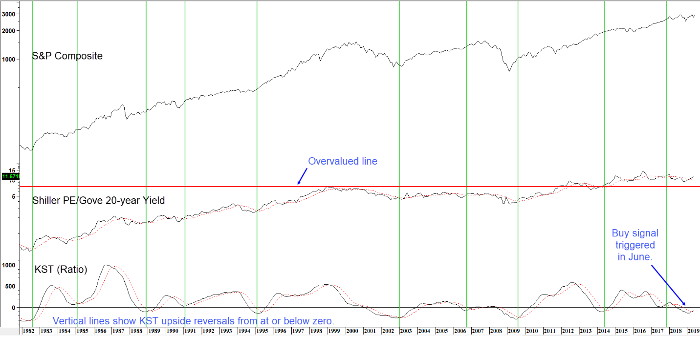
Sources: Pring Research, Reuters, www.econ.yale.edu/~shiller/data.htm
When the oscillator crosses above its MA, equities usually rally. (click chart to enlarge)
Finally, Chart 7 features the 12-month ROC for the S&P Composite. It recently triggered a bullish signal of primary trend importance. These setups develop when the ROC first drops below the -5% level and subsequently rebounds back above zero. The -5% line is shown in blue, and zero in black. The vertical lines flag the 17 occurrences since the 1950’s when this setup has been triggered. Fifteen (solid green) were profitable and two (red dashed) were not. The average gain for a 1-year holding period was 11.8%. If we extrapolate that average gain from February’s buy signal it would mean a rally in the S&P Composite to 3063.
Chart 7 S&P Composite and a 12-month ROC 1953-2019
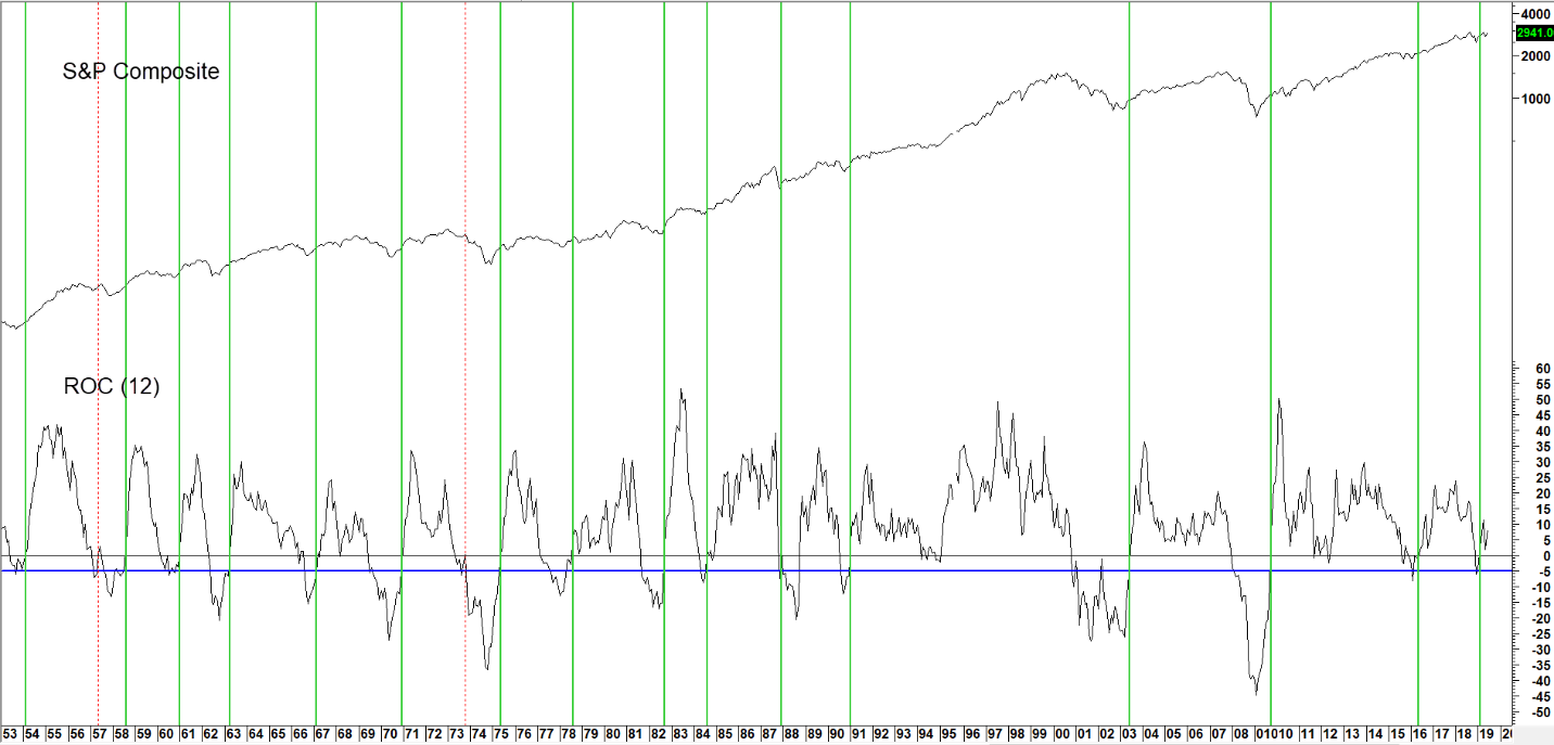
Sources: Pring Research, Reuters
When the ROC drops below the blue line and subsequently crosses zero a buy signal is triggered. (click chart to enlarge)
Summary
The economy is showing early signs of emerging from it’s third slowdown of this 10-year economic expansion. While encouraging, these green shoots are not yet sufficiently plentiful or strong to conclude beyond a reasonable doubt that a re-acceleration in the growth rate lies ahead. On the other hand, the stock market invariably moves ahead of the economy, and several historically reliable technical indicators have just gone bullish. Putting all the evidence together, it seems to us, that if the economy were headed for a recession stocks would be falling rather than approaching new all-time highs. For the economy and stock market investors that likely means that even better days lie ahead.
Martin J Pring – July 1, 2019
Cover Photo by AbsolutVision on Unsplash